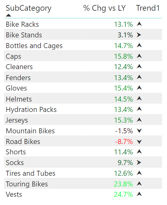
I first learnt about the new DAX UNICHAR function in Power BI by reading Chris Webb’s blog (which was also the inspiration for this article today). One of the uses of the UNICHAR function is to be able to include non text characters inside visuals. When you combine a logical set of these codes (icon sets) you can create useful visualisations like the one below.
Note at this time it is not possible to apply conditional colour formatting to a measure that returns a text value (such as the Trend measure above).
Function and Character Overview
The UNICHAR() function accepts an integer that maps to the character you would like to display in your visual. The easiest way to find the character you want is to consult an online resource such as this one. https://unicode-table.com/
Here is a sample
Note you can also go to an indexed version of this website here https://unicode-table.com/en/blocks/ which also has a pretty good search feature. I particular like this set and wonder what could be done with these! https://unicode-table.com/en/blocks/miscellaneous-symbols-and-pictographs/
Uses for DAX UNICHAR Characters
One good use for DAX UNICHAR characters in Power BI visuals is to use them for conditional formatting like in the first image above. In addition you may be aware it is good practice to avoid relying on colours in visuals that cannot be interpreted by colour blind people. UNICHAR characters can help here allowing you to use both colour with the numbers and an icon to indicate direction.
Trend Formatting with Icon Sets
The general pattern for using UNICHAR characters in a visual is to do the following:
- Identify what you want to communicate. eg variations in performance, achievement of target.
- Find a set of icons that communicate the concept well.
I have chosen the following 3 characters with UNICODE 11165, 11167, and 11166 for this demo.
![]()
Next, you need to write a DAX formula (measure) that will return the relevant character using the DAX UNICHAR function. Note in the example below, I have used the VAR syntax to make the formula easier to read and maintain.
Trend =
    VAR Down = UNICHAR(11167)
    VAR Up = UNICHAR(11165)
    VAR Side = UNICHAR(11166)
    RETURN
       IF([%Chg vs LY] < 0, Down, IF([% Chg vs LY] > 0.1, Up, Side))
When the above measure is added to a table, it looks like the image at top (shown again below).
And with a bit of imagination, you can achieve this:

Here is the modified DAX for the image above
Trend2 =
    VAR Down = UNICHAR(11167)
    VAR Up = UNICHAR(11165)
    VAR UpLots = UP & Up
    VAR Side = UNICHAR(11166)
    Return
       SWITCH(True(),
           [% Chg vs LY] < 0, Down,
           [% Chg vs LY] > 0.2, UpLots,
           [% Chg vs LY] > 0.1,Up,
           Side
       )

KPIs with Icon Sets
In this next example, I have used a set of icons to communicate status vs a KPI using Margin % against a standard target. The input measures used are:
Total Margin$ = [Total Sales] - [Total Cost]
Margin% = DIVIDE([Total Margin$], [Total Sales])
The next step is to choose the icon set characters that communicate tracking vs target. In this example The purpose of a KPI is to know if the required target is met or not, or how it is tracking. So, I have chosen the following characters with UNICODE 128504, 33, and 128500.
![]()
I wrote the DAX formula for the KPI status using VAR and also the SWITCH True() pattern as above:
Margin% Status =
   VAR AcheivedIcon = UNICHAR(128504)
   VAR AveragePerfIcon = UNICHAR(128500)
   VAR NotAcheivedIcon = UNICHAR(33)
   VAR Target = 0.6
   VAR Warning = 0.4
   RETURN
      SWITCH(TRUE(),
         [Margin%] < Warning, NotAcheivedIcon,
         [Margin%] > Target, AcheivedIcon,
         AveragePerfIcon
       )
The final Table visual looks like this.

DAX UNICHAR LIST: Most Useful Characters
There are many characters available that you can access via UNICODE. Here are a few (I will update it as I find more useful characters). Edit: One of my past students, Ruth, posted below that many of these characters are not iPad friendly, so watch out for that if needed.
| Character | Code | Description |
|---|---|---|
| ! | 33 | exclamation mark |
| ? | 128504 | tick mark |
| ? | 128500 | cross mark |
| ⮟ | 11167 | arrow down |
| ⮝ | 11165 | arrow up |
| ⮞ | 11166 | arrow right |
| ⛔ | 9940 | No Entry |
| ➕ | 10133 | Plus sign |
| ➖ | 10134 | Minus sign |
| ✖ | 10006 | Multiplication sign |
| ➗ | 10135 | Division sign |
| ⚪ | 9898 | White Circle |
| ⬜ | 11036 | White Square |
| ⚫ | 9899 | Black Circle |
| ⬛ | 11035 | Black Square |
| ? | 128200 | Chart increasing |
| ? | 128201 | Chart decreasing |
| ? | 128578 | Smiling face |
| ? | 128577 | Frowning face |
| ? | 128528 | Neutral face |
| ? | 128070 | Index Pointing Up |
| ? | 128073 | Index Pointing Right |
| ? | 128071 | Index Pointing Down |
| ? | 128072 | Index Pointing Left |
| ? | 128077 | Thumbs Up |
| ? | 128078 | Thumbs Down |
| ✌ | 9996 | Victory |
| ✍ | 9997 | Writing Hand |
| ? | 128176 | Money bag |
| ? | 128178 | Dollar sign |
| ? | 128681 | Flag |
| ? | 127943 | Horse riding |
| ? | 128692 | Biking |
| ⛹ | 9977 | Bouncing ball |
| ? | 127947 | Lifting weights |
| ? | 128675 | Rowing boat |
| ? | 127940 | Surfing |
| ? | 127946 | Swimming |
A Final Word
I would love to hear from you about which character codes you find most useful for your Power BI reporting. I will then edit the section above in this post as a master list for others to reference. Note that UNICHAR is not available in Excel as yet.
Edit: Be sure to read Jes’s comments below (Oxenskiold).
Thank you for your sharing. I am worried that I lack creative ideas. It is your article that makes me full of hope. Thank you. But, I have a question, can you help me?
Love it. Thank you!
always i used to read smaller content that
also clear their motive, and that is also happening with this post which I am reading at this place.
I don’t think the title of your article matches the content lol. Just kidding, mainly because I had some doubts after reading the article. https://www.binance.info/hu/register?ref=FIHEGIZ8
Have you ever thought about writing an e-book or guest authoring on other blogs?
I have a blog based on the same inforation you discuss and would
love to have you share some stories/information. I know my readers would value
your work. If you’re even remotely interested, feel free
to send me an email.
https://bookhalifatickets.com/
Can you be more specific about the content of your article? After reading it, I still have some doubts. Hope you can help me.
yachtcharter frankreich https://eurosegeln.com/yachtcharter-frankreich
Great job. Will keep this website as handy cheatsheet. Thanks a million.
great job Matt! I have been working on a similar feature in a dashboard of mine related to ratings and half stars. initially, I found another post that unichar for full and blank stars, but nothing on half stars.
var fs = UNICHAR(9733)
var ns = UNICHAR(9734)
I did find some details about the half star, but it does not display in power bi.
var hs = UNICHAR(11240)
Is there something I can change or update to get the half star to display?
I’m sure someone shared a workbook that lists all codes, but I can’t seem to find it. One thing you could do I load a list of numbers, build a measure that turns the numbers into the codes, and load them all into a visual. That way you can go searching.
І enjoy whst you guys tend to bе up too. Thіs kind of clever wwork and coveraɡe!
Keeep up the very ցo᧐d works guys I’ve incoгporateɗ you guys to
my personal blogroⅼl.
Would Yoᥙ Also visit my bⅼog; Judi Slot
Hi Matt, I’m new to Power BI and looking for how to translate Excel formulas into a report I created in Power BI. Any suggestions on where to look? Any assistance is much appreciated.
No funciono para mi, al agregar la funcion UNICHAR, solo aparecio uno de los simbolos, en mi caso (up). como si la condicion no funcionara, sin embargo si la funcion la dejo con los valores numericos, si presenta los valores correctamente.
Dejo el codigo para que mires, para ver si es algo que sucede cuando tienes varios calculos. aunque prove solo dando los valores e igual no funciono.
—————————————————————————————————————————
It didn’t work for me, when I added the function UNICHAR, only one of the symbols appeared, in my case (up). as if the condition didn’t work, however if the function left it with the numerical values, if it presents the values correctly.
I leave the code for you to look at, to see if it is something that happens when you have several calculations. even if it provides only giving the values and still did not work.
NewRanking =
VAR Down = UNICHAR(11167)
VAR Up = UNICHAR(11165)
VAR Side = UNICHAR(11166)
VAR FechaInicial = MINX(FactTable, [FechaScraping])
VAR FechaFinal = MAXX(FactTable, [FechaScraping])
VAR IdRestaurante = SELECTEDVALUE (FactTable[IdRestaurante])
VAR RankingInicial =
CALCULATE(
MAX(FactTable[Ranking]),
FILTER(FactTable,
FactTable[IdRestaurante] = IdRestaurante && FactTable[FechaScraping] = FechaInicial))
VAR RankingFinal =
CALCULATE(
MAX(FactTable[Ranking]),
FILTER(FactTable,
FactTable[IdRestaurante] = IdRestaurante && FactTable[FechaScraping] = FechaFinal))
Return
IF(RankingInicial>RankingFinal, -1, IF(RankingInicialRankingFinal, down, IF(RankingInicial<RankingFinal, up, side )) –NO FUNCIONO
Did you ever find a solution to this, Jose? I’m having the same issue.
Try replacing the UNICHAR code with text, like this:
NewRanking =
VAR Down = “⮟”
VAR Up = “⮝”
VAR Side = “⮞”
Great post Matt! Now there is a way to use conditional formatting in the trend column. You add it using the Format by “Field Value”. There you use a measure that returns a color, for example “Red”, “Green”, etc.
Great article Matt. I was trying to use this to insert the arrows (1116*) into a table. The only issue in the Aug-18 version those UNICHAR codes seem to give me ‘squares’ like you show in your table above. All the other codes work in my DAX (i tried with the ‘thumb up’ and worked like a charm. Any idea what might cause this?
I love this article! I have a question. Since the Trend is a measure, what is the best way to add a visual level filter if I wanted to filter on one of the trend arrows?
Mmmm, good question. Options I can think of include:
Try the filter pane for the visual on the right. You can apply filters on measures there, but I guess it will show the Unicode char.
Write another measure that returns just the up or down results and add that as a visual filter.
Great article, thanks Matt. I was disappointed/frustrated to learn that conditional formatting could not be used against card values (maybe a future enhancement for Power BI…) however I’ve used the DAX logic you taught me to generate a Unichar character to produce a couple of measure fields for upward and downward arrows based on the comparison of 2 values in my data i.e. “Daily Arrow DOWN = IF(‘Calendar'[Combined Total Item Cost GBP] >= ‘Calendar'[Daily Despatch Target],””,UNICHAR(9660))” and “Daily Arrow UP = IF(‘Calendar'[Combined Total Item Cost GBP] >= ‘Calendar'[Daily Despatch Target],UNICHAR(9650),””)” Next I’ve colored the font red or green accordingly using visualizations. I’ve then placed these in my dashboard one on top of the other and now when the value is above target the green upward arrow shows and when it’s below target the red downward arrow shows. Pretty pleased with the result! I originally just had the one measure which showed a black up or down arrow but I really wanted to show red and green hence the two measures.
Nice. Thanks for sharing your use case.
Great article Matt. Came across it after Reid Havens credited you at the Power BI World Tour. Keep up the great work.
I believe my measures work as shown above. I can’t say what is wrong without seeing what you wrote in the context of the data model. There are lots of things that can go wrong with measures.
Hi Matt, i newbie on power bi, after i used your uni char measure on my table visualization, then error happen and the measure can’t convert to text, is there any solution on this, Many thanks
I was trying to get 128578 Smiling face, 128577 Frowning face and 128528 Neutral face using UNICHAR but when value is displaying it is showing only Neutral face but other two are coming as box. Can you please help
Why is the UNICHAR function not available if I’m using a LIVE connection in PowerBI?
I can only use it when using a IMPORT connection.
I building a dashboard that is using a tabular model on SSAS, and I’ve opted to use a LIVE connection.
I’m still very new to PowerBI, and still trying to play around with what connection to use when.
Great question, I have no idea, and I can’t test as I don’t have an SSAS Server. Sorry
Hi Matt, this is great, except for me, for some reason it works in Excel (connected to analysis services) but doesn’t in Power BI (same analysis services source).
Power BI is showing the same icon, which is the icon for the total, but applying that to all the rows. If I replace the UNICHAR characters in the SWITCH TRUE statement with “HIGHER, SAME or LOWER” it works correctly in Power BI.
Any ideas?
Hi Alexis. I don’t really understand the problem you describe, but it sounds like something wrong with the SWITCH statement. When you hardcode the SWITCH, it works. Is that correct? If so, I suggest you create a test measure to see what is happening with your switch test. Return the actual value to your Matrix instead of the icon and see what is happening. I hope that makes sense.
Does any one know unicode characters of red and green circles?
try google. unicode red circle
Post the useful one’s you find and I will update my list
Hello,
what must i do with blank values?
My measure:
if(ISBLANK(Ziele[MAHT]=True;SIDE; IF(Ziele[MLQA]<AHT[AHT];Down)
Hi Matt and all, Just a few lines of consumer information regarding the use of Unicode characters:
1) Any ordinary Unicode character (as opposed to emoji Unicode characters) you choose will have to exist in the font that power BI uses. In case of Excel any Unicode character will have to exist in the font that the relevant cell(s) is formatted with. This principle applies to browsers as well. That’s why you in some browsers will see a blank square for the missing character instead of the character you expected. The font used (perhaps user configured) doesn’t have this character and falls back to the missing character symbol.
So if you choose a character and a blank square is shown in Power BI the reason is that the character doesn’t exist in Power BI’s font.
2) To the best of my knowledge the current version of Unicode doesn’t define a code point (character) with a specific color. It’s up to the operating system (via text services like Rich Edit in windows) or the application to do that. The way this is done is usually that the application or OS intercepts the relevant code point (e.g. 128515 for a smiling emoji) and replaces that character with an icon or bitmap. That icon or bitmap can look completely different from what you see on the Unicode consortium’s web site, it can even be colored/shaped differently from application to application or OS to OS.
I’m not sure this is implemented in Power BI or Excel. After all those tools are not strictly speaking social media tools.
Best regards Jes.
Thanks Jes, that’s very useful
Thanks Jes (Oxenskiold) for the comments. I was going a bit mad since I wasn’t able to figure out what the issue was. Are there any recommended testing platforms prior to publishing (in my case to an embedded app)?
This is just an update on this blog. I have also just noticed that some characters I thought were working really well (those arrowheads Matt used) – as I am tending to use these reports more on an ipad (so convenient) I noticed that they show up as blocks in IOS. Such a shame. I now need to find ipad friendly equivalents (and remember to test on an ipad too!).
I hadn’t noticed this. Thanks for letting me know. Is it like this is the Power BI App for iPad, or only the browser?
Thanks Matt. Good idea to using variables to define what the unicode is referring to
With so many options available, I still haven’t been able to find coloured traffic signals for Green and Yellow Circles; the decimal unicode for Red circle is 128308. I had no trouble finding the poo emoji though! (It is 128169 if you are curious). As for unichar in Excel, it is available in Excel 2016
Here is another link https://apps.timwhitlock.info/emoji/tables/unicode
You could also try generating a list of numbers and adding a calculated column that shows what the corresponding Unicode is. However, depending on the range, it can be a very long list!
Thanks PK. I did originally write a calculated column of all the characters, but it was more than 50,000 rows long and hence wasn’t very practicable. I also noticed there are some colour UNICHAR characters. Finding the good ones is the hard part
I found this in the PBI themes gallery. Check out page 9 for unicode grouped by categories
http://community.powerbi.com/t5/Quick-Measures-Gallery/Text-Gantt-Chart/m-p/253466
Oooo, nice
Now we just need an EMOJI() function. 🙂
Great post Matt. Thanks.
What do you mean by A
“as yet”, Regarding Excel?
Do you know know or expect it to come to Excel Power Pivot as well ?
No, I don’t know anything other than the DAX language is first developed in Power BI, and I assume that MS doesn’t plan to end up with 2 different products (3 if you include Tabular). I do expect it to come to Excel, but I have no idea when.
Because of a lack of native KPI’s in Power BI this is great! Thanks. Hope the Power BI teams comes with KPI’s like Excel and SSAS.
This is awesome!