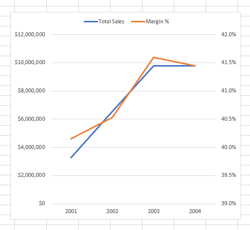
As most readers of my website would surely know, Microsoft Excel has had a dual axis line chart as a standard charting visual for many many (many) years. A dual axis line chart is needed when you have 2 sets of data to display with significantly different scales like the one shown below.
Unfortunately, Power BI does not support a dual axis line chart as a standard visual at this time. Update 11 Mar 2020: Microsoft released a dual axis line chart as part of the Mar 2020 Desktop update. The good news however is there is a custom visual called “Multiple Axes chart by xViz” that can do this in Power BI. This visual has been around for a while, but there have been some formatting issues (in my view) that prevented it being a solution to this problem – that is now fixed). I will demonstrate how to set up a dual axis charge using the Adventure Works database and this visual.
Sales Data and Margin % on the Same Chart
I have a Power BI workbook with the Adventure Works data loaded into the data model.
I have written the following measures.
Total Sales = SUM(Sales[ExtendedAmount])
Total Cost = SUM(Sales[TotalProductCost])
Total Margin = [Total Sales] - [Total Cost]
Margin % = DIVIDE([Total Margin], [Total Sales])
I will place the Total Sales on one Y axis and Margin % on the other Y axis with the X axis showing the trend over time.
Importing the Custom Visual into Power BI Desktop
To import the Multi Axes Chart custom visual, click on the overflow menu in the VISUALIZATIONS pane (#1 below) and then on Import from marketplace (#2 below).
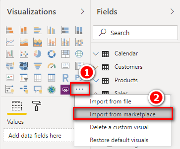
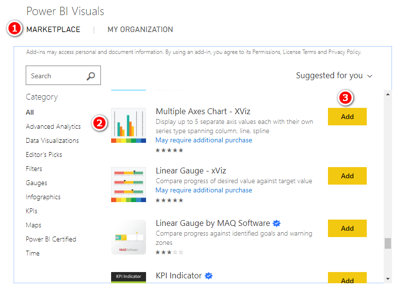
In the Power BI Visuals dialog, click on MARKETPLACE (#1 below), select Multiple Axes Chart – XViz (#2 below) and then click on Add (#3 below).
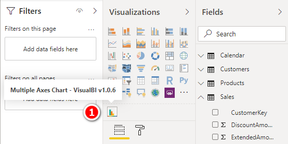
You will get a message that the custom visual is imported and the visual icon appears below the VISUALIZATIONS pane.
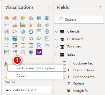
Next, you can pin the custom visual to the VISUALIZATIONS pane by right-clicking on the custom visual and then clicking on Pin to visualizations pane (#1 below). This will mean the custom visual will always be available to you when you next create a Power BI Desktop file from scratch without the need to import it again.
How to Create a Dual Axis Line Chart
- Add the Multiple Axes Chart visual to the report canvas.
- Add CalendarYear to Axis
- Add Total Sales to Value Axis 1
- Add Margin % to Value Axis 2
You will get a dual axis column chart to begin with as shown below.

Note that you can have up to 5 Y-axis, hence the name Multiple Axes Chart.
- Click on Format (the paint roller icon) and choose Series Type (#1 below) as Line for both Total Sales (#2 below) and Margin % (#3 below).
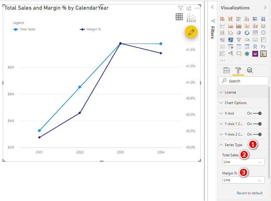
And that’s it. I have the dual axis line chart in Power BI.
You have plenty of formatting options.
I changed the data colours, put a Filter on CalendarYear to show 2003 data, added MonthName to Axis and CalendarYear to Legend.

This chart clearly displays Total Sales and the trend of Margin % over time.
Here is the sample workbook that I used – dual axis line chart sample.
Here is a link to the custom visual https://xviz.com/visuals/multi-axes-chart/
На данном сайте можно получить мессенджер-бот “Глаз Бога”, позволяющий собрать всю информацию о человеке по публичным данным.
Инструмент работает по фото, используя публичные материалы в сети. Благодаря ему осуществляется 5 бесплатных проверок и глубокий сбор по имени.
Сервис обновлен на 2025 год и охватывает аудио-материалы. Сервис гарантирует проверить личность в открытых базах и предоставит информацию за секунды.
рабочий глаз бога телеграм
Это бот — помощник при поиске граждан онлайн.
Здесь вы найдете интимные фото и ролики.
Контент подходит тем, кто старше 18.
У нас собраны разные стили и форматы.
Платформа предлагает четкие фото.
порно чат онлайн
Вход разрешен после подтверждения возраста.
Наслаждайтесь возможностью выбрать именно своё.
thank you so much for this…fabulous!
Is there an option to set X axis range to “Auto” instead of it starts from 0?
let ‘s say, i have 3 Y-axis (Sales , %Sales, RegionSales ) in chart and i want to hide one of the Y-axis (e.g. RegionSales), is it possible in this chart
Hi Matt, thanks for this demo of XViz dual axis chart. I just downloaded your example but the curves are not that nice… both Y axis start from 0 so the view is crushed on the top! Did you have to configure specific Min / Max for Y axis or did you let the “Auto” function? If “Auto” function does not work for Y axis Min adjustment it makes the XViz charts kind of useless for efficient lines comparison…
Thanks for your help,
This is great. Is there a away to adjust the spacing on the X Axis, so that you don’t need to scroll for the entire view? For example I have 2 line charts that need to at Month/ Year Granularity for 5 years. I’ve tried Date binning with 2 month groups. The point seem rather far apart and could save some space if they were able to be spaces closer together.
You will need to contact the developer support for that question.
Format -> X Axis -> “No. of Data Series Displayed”
You can specify also the Inner Padding to customise your visual. (Make bars thicker or thinner)
This is great news, Matt! Thanks for the detailed walkthrough.
Excellent!
Suggestion: I’d like to be able to mix columns chart (one axis) with line chart (another axis).
This can be done with both the standard charts and also with this xViz chart
The technique is fine, but I think it’s a good opportunity to raise the subject of how data should be shown in charts.
Infographic conservative rules are against Dual Axis Charts.
In Excel there is no respect to Infographic rules, and many of the graphs you see are full of Infographic mistakes.
Power BI team are much more aware of this issue and I think rightly so.
There are many links if you search the web that talk about it (try this: why not have Dual Axis)
Thanks Matt. Such a simple yet powerful visualisation. Maybe a day will come when PowerBi visuals look as good as ThinkCell and have the ability to add chart notations
Thanks Matt. Such a simple yet powerful visualisation. Maybe a day will come when PowerBi visuals look as good as ThinkCell and have the ability to add chart notations