Level: Intermediate
Last week I shared how it was possible to easily create an online survey using Excel for O365. Once such a survey is created, the data can be imported into PowerBI.com and used to create a simple report. The biggest issue with directly connecting to OneDrive like I showed last week is that you can’t do any serious data modelling. You can’t write any DAX measures or join other tables into the data model etc. Not being able to build a proper data model with my data set last week created the following issues (I am sure there are more).
-
- I couldn’t easily create a sort order column for my “how long have you been reading” question (hence why I needed to prepend a letter A, B, C etc to get the answers to sort).
- Without data modelling, there was no easy way for me to cleans the data. eg Some people said they came from “United States” and others said US, but that didn’t work in my map (it had to be consistent).
- I couldn’t write proper measures such as countrows(survey) to find out how many surveys there were. Instead I had to rely on “Count of Name”. If someone left the name field blank, it would not be counted.
- I couldn’t change the column names to be something more suitable for reporting – I was stuck with the actual survey questions in the visualisations.
All of these issues (and more) are solvable if you can simply build a regular data model, but this is not possible when you directly connect PowerBI.com to a flat table of data in the cloud.
This article explains how you can create a data model with a cloud based service (like OneDrive) and also how I then went about improving the reporting from last week given I could crate a proper data model.
Connecting Power BI Desktop to OneDrive
The alternative to connecting PowerBI.com to the OneDrive file is to use Power BI Desktop instead.
- First build a data model using Power BI Desktop connecting to the cloud copy of the OneDrive file.
- Publish the Power BI Desktop file to the service in the cloud (after you have done your data modelling of course)
- Configure Power BI cloud service to directly authenticate to OneDrive in the cloud so that it can directly access the OneDrive data without further configuration or gateways. Power BI automatically refreshes the data for you approximately once every hour or so.
Let me demonstrate how to do this using the same survey from last week. If you haven’t already completed the survey you can do so by clicking here and then see you survey response included in the reporting below. You can read about how to create an Excel survey like this from the blog article last week.
Copy the URL to your OneDrive File in the Cloud
There are a few ways to do this but the way I did it was to copy the URL of my OneDrive XLSX file and then use that to import the data “From Web”.
Get the URL
The tricky bit is finding the correct web URL of your file on OneDrive. The way to do this is to open the Excel file in Excel on your PC and extract the URL from there. You can either open the file from OneDrive in the cloud or the copy on your PC (I used the one on my PC).
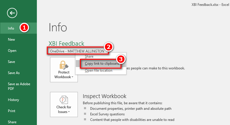
Once you have the file open in Excel, click on the File menu, then Info (1 below), click on the OneDrive Link (2 below) and then click “Copy link to Clipboard” (3 below). This placed the link into the clipboard.
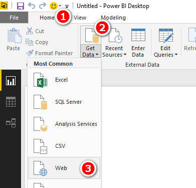
With the URL still in the clipboard, I created a new Power BI Desktop report using Get data, Web as shown below.
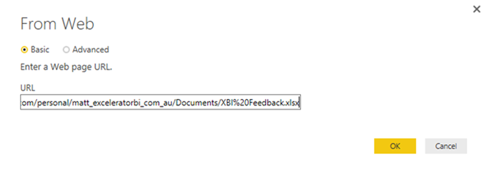
I then pasted the URL from the clipboard and manually deleted everything from the question mark to the right (highlighted below).
So I was left with the following
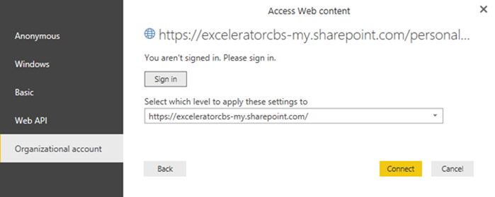
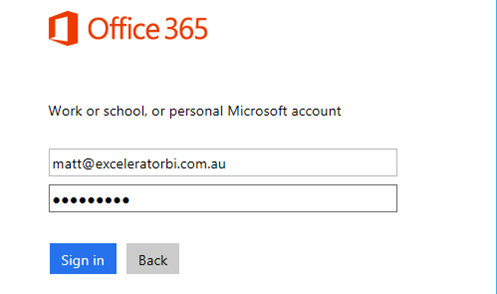
I then got the following complicated set of options for Authentication. I took the last option to sign into my Organizational Account, and signed in with my Office 365 credentials
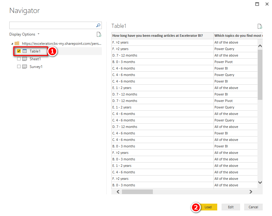
After authenticating, I was able to import the table of data into Power BI Desktop and Load as normal.
Load to Power BI and Configure Credentials
I will continue the process of building out my data model further down the page, but first let me complete the process to publish and configure the online credentials process.
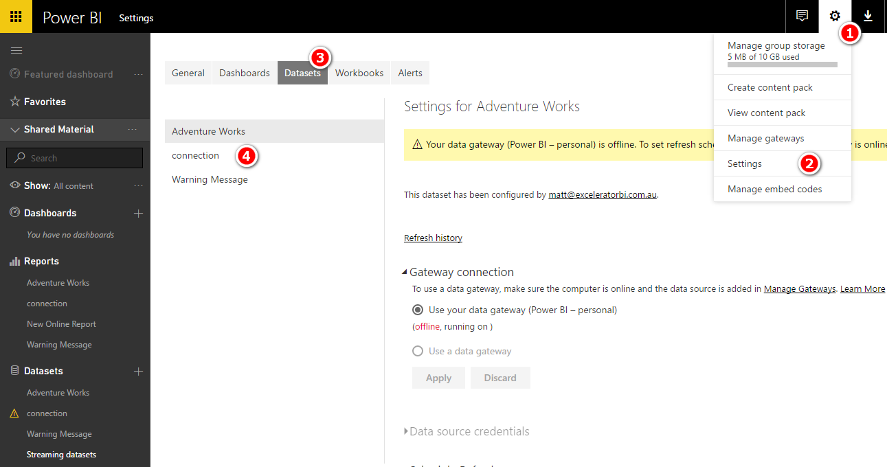
First I saved the query (close and apply), saved the workbook and published it to my PowerBI.com account. Once the dataset was in the cloud, I needed to configure my credentials for the dataset. I clicked on Settings (1 and 2), Datasets (3) and then selected my dataset (4 below)
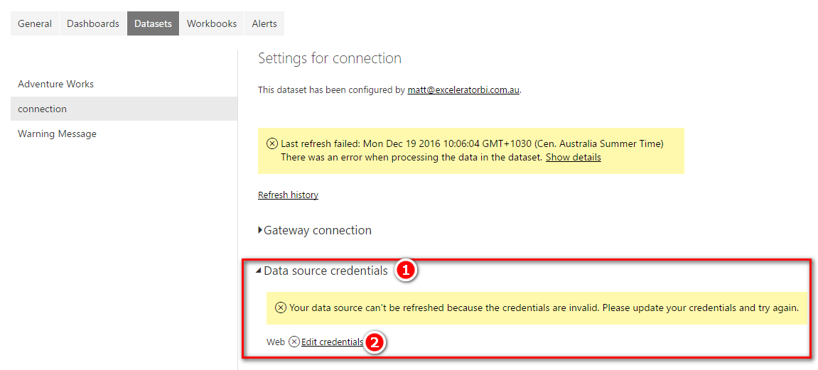
Because this is an online data source, I was able to edit the credentials as shown below.
After clicking Edit Credentials, I selected OAuth2 and signed in.
And I then got this confirmation.
Improving the Reporting Using Data Modelling
Back to the data modelling in Power BI Desktop. The first thing I did was turn off data load for the table I had previously loaded. This was quite easy. Right click on the table, then uncheck “Enable Load”. This keeps the connection to the table but doesn’t load it in the current form.
The rest of this article explains how I changed the data to make it more useable in my final report.
Cleanse the Country Data
The next thing I did was create a data cleansing table for the list of countries. Ideally the survey tool would provide a list of all valid countries to select from a list, however this is not available using the simple online Excel survey tool I am using. Instead I created a substitution table where I can manually create substitutes for data that I wanted to change.
I created a new query with reference to the first. Right click on the first query (1 below) and then select Reference (2 below).
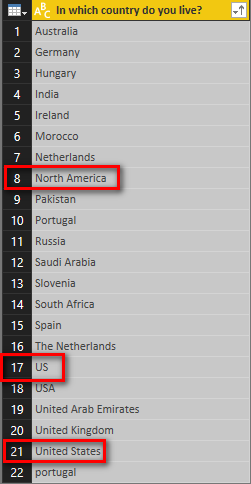
I then deleted all columns other than the country column, removed duplicates and sorted the column. Finally I set it to disable load. It is now possible to see all the data points entered and identify the dirty data that was included (shown below).
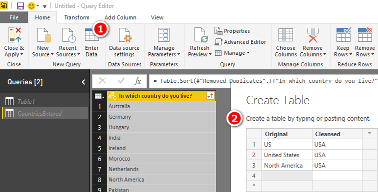
I then created a manual mapping table to make it easier to control the data cleansing process. To do this, I simply created a new manual table in Power BI Desktop as show below (and also turned of data load).
Sorry to the non descript North American if you happen to be Canadian, Mexican or of some other Nationality. I decided to map this to the USA.
Now I had the mapping table, the next step was to replace the original country data with the cleansed data. I created a new query referencing Table1, then joined on the country columns to the CountryCleanse table.
Using a Left Outer Join as shown below
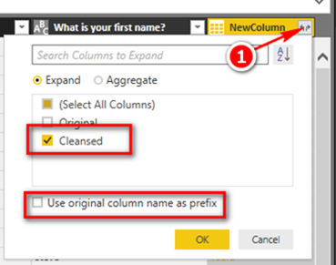
I then expanded the new column to extract the cleansed version of the data.
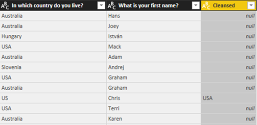
This gave me a new column that contains the substitutes in the case there was a match in the cleansing table.
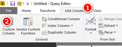
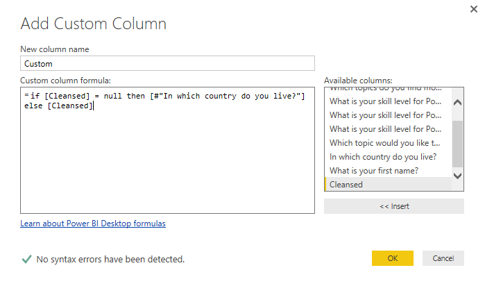
I then created a new custom column that uses this cleansed column if it exists, otherwise the original column.
I then deleted the other 2 columns and renamed my new column so that I had a cleansed copy of the Country.
If you want a comprehensive lesson on how to use Power Query, checkout my training course here https://exceleratorbi.com.au/product/power-query-excel-power-bi-online-training/
Cleanse and Sort “How Long” Answers
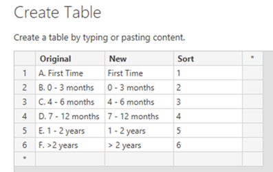
In my survey question, I asked how long had the participant been reading my blog. When the answers were placed in Power BI they didn’t sort based on length of time (they sorted alphabetically). To fix this (using the original approach I blogged about last week) I was forced to add a prefix to force the answers to sort logically. Using Data Modelling, it is possible to solve this problem properly. For variety (in this blog), I decided to use a different mapping table solution. I first created a mapping table with the original survey choices, a new set of labels and a sort column as follows.
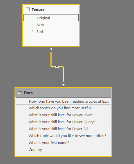
Then I loaded this mapping table as a lookup table to my data model and joined it on the Original column as the key.
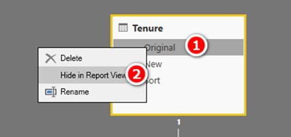
Then to avoid confusion in the final report, I hid the original columns in both tables. Right click on the column (1 below) and then select Hide in Report View (2 below).
Of course I sorted the Tenure column
Adding “All of the Above” into the other 3 choices
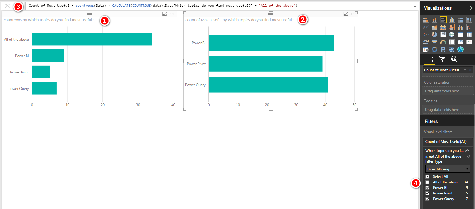
The last problem I wanted to solve was that many people chose “All of the above” when asked about their favourite topics. When this was put in a visual (shown as 1 below) it is not possible to see the overall most popular item.
There are many ways to handle this problem. The measure I wrote was as follows:
Count Most Useful =
     COUNTROWS(Data)
         + CALCULATE(
                  COUNTROWS(Data,
                  Data[Which topics do you find most useful?] = "All of the above"
              )
The measures simply adds the count for each item and also adds “All of the above” as well (shown as 3 above) and I then simply filtered out the “All of the above” answer from the visual (shown as 4 above).
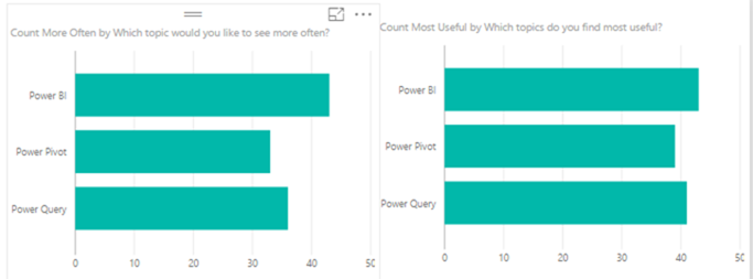
My report was starting to look good (see below) but I still wasn’t happy.
Ideally I should be able to show “what is most useful” and also “What do you want to see more of” in a single bar chart. But the problem was that there were 2 different measures and the “bars” are coming from 2 different columns in the data source. This could not be solved without thinking differently about the problem.
I created a new table that has the 3 responses and loaded it to the data model. I didn’t connect this table to any other tables in the data model.
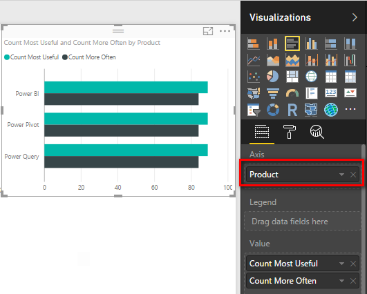
I placed this new column of data as the Axis of my visual and place the 2 measures as Values. This then gave me a chart that looked like I needed, but of course there was no filtering, because the new “Types” table is not connected to anything in the data model.
This is important: The Axis is part of the filter context, the Types table is being filtered by the visual, but this filtering is not being used in the measures I wrote.
So I changed the measures so they would “harvest” the value on the Axis to filter the results.
Count Most Useful =
     IF(
         HASONEVALUE(Types[Product]),
         CALCULATE(
             COUNTROWS(Data),
             Data[Which topics do you find most useful?] = VALUES(Types[Product])
         )
         + CALCULATE(
                 COUNTROWS(Data),
                 Data[Which topics do you find most useful?] = "All of the above"
             )
     )
The final visual looks like this, which is much easier to read and understand.











I don’t think the title of your article matches the content lol. Just kidding, mainly because I had some doubts after reading the article. https://www.binance.info/ru/register-person?ref=V3MG69RO
DUDE. The trick to open the file in Excel for the desktop to get the correct URL was a LIFESAVER. This was specifically for the error message:
An exception occurred: DataFormat.Error: The input URL is invalid. Please provide a URL to the file path on SharePoint up to the file name only (with no query or fragment part)
Your tip deserves high praise. THANK YOU!!!!
Glad it helped
Hi Matt – is this still possible to do? It works if I manually connect via Power BI service, but not through Power bi for desktop. Always get status code 400 after entering the credentials for my corporation. I posted a thread on powerbi community as well but haven’t heard any thoughts on the matter.
I have no reason to believe anything has changed but I haven’t tested it since I wrote the article. If I get some spare time I will take a look.
@Matt – Will this work for One Drive Personal ?
I think not from what I have read, but I haven’t tested it.
Great stuff Matt. I did something similar recently with a year’s worth of data from a customer checkout survey I have implemented on our artist commerce sites. The usual kind of questions (why did you purchase from here, rate your experience, etc). But I also had two questions that asked for some general comments. One of them was “what product would you like to see in the store”. This of course results in a multitude of different answers, and short of reading every single one of them, it’s hard to gain any real insight. I instead used WordCloud visualization. Required some fine tuning – remove all articles and common words (“a, an, the, of, from” etc) , but in the end, a picture emerges. I can see, for instance, that “autographs” is a common request.
Also, thanks for the dataset connection tips. Will be very useful!
That’s great Travis. It can be hard to find real world examples for Word Cloud but yours sounds very interesting.
Very good tip. Thanks Matt
Thanks Matt,
Can’t wait to try this myself. In saying that cannot se the final (requires a login?)
Cheers.
Nice one Matt. I wonder if it’s also simple enough to use Google Forms instead of Excel Online Surveys. Although I guess the main problem with using Forms would be keeping the linked Google Sheet private and sharing authentication with Power BI. Maybe Excel Online Surveys are the best way to go after all.