There was a new feature released in the June 2019 version of Power BI Desktop that I really like and I think warrants some explanation and review. The new feature allows you to pre-filter a slicer so that it only contains a subset of values that would otherwise appear in that slicer.
Filters on Non-Slicer Visuals
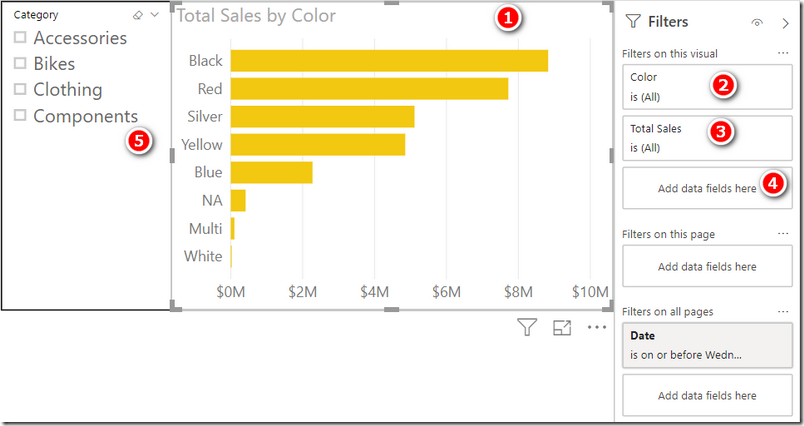
It has been possible to pre-filter other types of visuals since the start (but not Slicers). Take the following example shown below.
In the image above, there is a bar chart (1) and a slicer (5). When the bar chart is selected, you can see there are a number of “pre-filter” options on the right hand side in the filter pane (note, this image shows the new filter experience – read about that at the end of this post). Using the filter pane (2 above), you can pre-filter colours in the bar chart so that only a subset of the colours are shown (see below).
It is also possible to pre-filter the visual using the Total Sales measure (3 shown in the original image at the top of the page). After removing the filter on colour above, I have applied a filter on the Total Sales measure so that only items with sales >= $5.1M are shown in the visual (see below).
This type of pre-filter is pretty cool because it is responsive to other filters on the page. For example, when I select Bikes from the slicer, the bar chart updates to show just the bikes that have sales >= $5.1M (shown below).
Filters on Slicers
Now back to the point of this post. As of June 2019, it is possible to pre-filter slicers as well. It may seem weird, but this previously wasn’t possible – it seemed weird to me, anyway. This is now fixed and it is possible to use the side filter pane in the same way as other visuals. I can think of quite a few useful scenarios, including:
- Hiding the dreaded (Blank) in a slicer. [Actually, please don’t do that, but instead fix your data model].
- Filtering out items not relevant (eg category managers may only want to see their own products)
- Hiding items with no sales
Hiding Items Manually
To hide a value you don’t want to see, just de-select it from the filter pane as shown below. In the case of the Adventure Works database, there are no sales for Components anyway, so it would be useful to remove this option from the list (1 below) so it doesn’t show in the slicer (2 below).
Auto Slicer Filtering
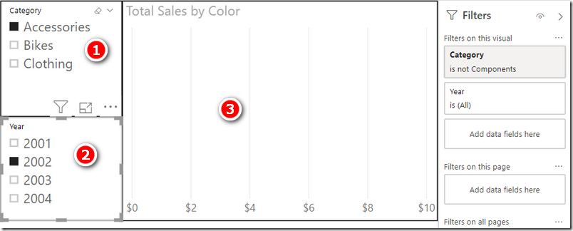
Another more interesting use case is to use the pre-filter to update slicers to only show data with sales. Take the example below. I have selected Accessories (1 below) and 2002 (2 below) in 2 different slicers that are connected to 2 different tables. There were no sales for Accessories in 2002, so the chart (3 below) is blank.
Using the new slicer pre-filters, it is now possible to have the Year slicer update based on the selection of the Category slicer without turning on bi-directional filters (please don’t turn on bi-directional filtering).
Now using the new pre-filter, I was able to add the Total Sales measure to the Slicer for Year and set it to > 0 (1 above). After applying this filter, the Year Slicer responds to selections in the Category slicer and will only show valid items.
New Filter Experience
As mentioned at the start of this post, the images I have shown in this article use the new filter experience. Previously the side filter pane was part of the fields list (on the right hand side, down the bottom). User feedback showed that people tended not to interact with this original filter pane even though it was intended to be an interactive part of the report viewing experience. The new filter pane experience is designed to address that, and make the side filter pane an active and interactive part of the report itself.
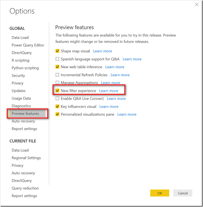
The new filter experience is turned off by default (as at June 2019). To turn on the new filter experience, go to File\Options and Settings\Options\Preview Features and turn on the new filter experience.
Click OK and then restart Power BI Desktop.
When you open an old workbook (one you have previously created), you will not see the new filter experience by default. You will need to go back into File\Options and Settings\Options\Current File\Report Settings and turn on the new filter experience for the current file.
Why Are There 2 Steps to Turn on This Feature?
You may be wondering why there are 2 steps to turn on this preview feature. Actually, it is standard practice by the Power BI team to make some new features a 2 step process.
- Step 1, enable the feature.
- Step 2, turn on the feature for existing workbooks.
The reason they do this is to maintain compatibility with existing reports in production. In the case of the new filter experience, this new feature changes the width of the report canvas. Imagine you have a beautifully built Power BI report in production , and then this new features is released. Your live production report now has less horizontal width and as a result the visuals on the report now don’t fit properly on the screen. This would be very annoying, and hence you normally have to first enable preview features (if you want to try them out) and then explicitly opt in to the new features for existing reports.


Great article!
Matt, how can I make the slices to filter based on a row selected in a table and/or graph?
I’m not sure what you are asking. Slicers filter tables automatically. Tables and Graphs also cross filter automatically.
Yes. As ever, nice and clear and to the point! Thanks Matt. Thanks for your Supercharge Excel book, I am feeling much more confident about what I am doing and feel that I have ‘method’ (as well as some ‘madness’). So thanks for that!
I’m glad you are making good progress. Please tell your friends 🙂
Good article, thanks Matt. I think the use cases are relatively unusual for this feature but at some point I can imagine that nothing else will suffice. As you say, it provides a consistent application of filters to the dashboard page and that can only be a good thing.
Great¡¡¡¡ “”slicer update based on the selection of the Category slicer without turning on bi-directional filters (please don’t turn on bi-directional filtering).””
Matt, now we need the measure driven filters on the rows of matrices so that you can have row “hierarchies” that demonstrate the same behavior as measure driven visually filtered slicers. This is a big gap because visualizations should be able to be designed without slicers that facilitate the same related / linked filtering.