Today Microsoft announced that it is now supporting icon sets to be used for conditional formatting in Power BI. This feature has been available in Excel, like forever, and it great to see it available now in Power BI.
Set Up Power BI Conditional Formatting Using Icons
I have a number of measures in my Power BI Workbook to demonstrate the new icons as shown below.
Total Sales = SUM(Sales[ExtendedAmount])
Total Sales Prior Year = CALCULATE([Total Sales], DATEADD(Calendar[Date], -1, YEAR))
Change vs Prior Year = [Total Sales] - [Total Sales Prior Year]
% Change vs Prior Year = DIVIDE([Change vs Prior Year], [Total Sales Prior Year])

The new icon feature is available under the conditional formatting menu. Below I have a table using some of the measures above. To add a Power BI conditional formatting icons set:
- Find the measure in the values section of the visual (a table or matrix)
- Click the menu next to the measure you want to apply conditional formatting.
- Select Conditional Formatting
- Select Icons
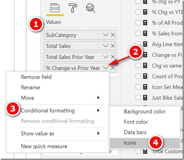
The default settings are:
- Format by rules
- Based on the value in the selected measure
- And 3 icons are provided evenly split across the range of numbers returned by the measure.
![]()
With the default settings, this is what my table visual looks like
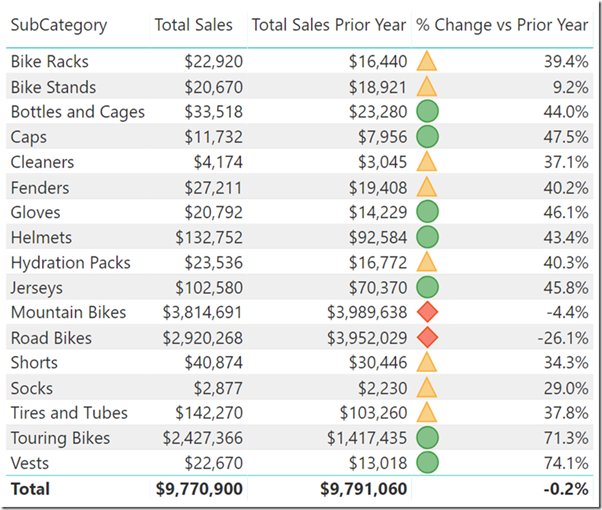
Note how the icons above have both shape and colour so you can differentiate between them even if you are colour blind. This is best practice.
You can also change the default formatting to work on the hard coded number settings that you specify. In the example below I have changed the settings to work on absolute numbers instead of percentages (note the changes in the highlighted boxes). Also note that I have set the minimum and maximum numbers shown as 1 and 2. To do this, simply delete the value in these boxes. Thanks to Chris Webb for finally helping me understand how this works.
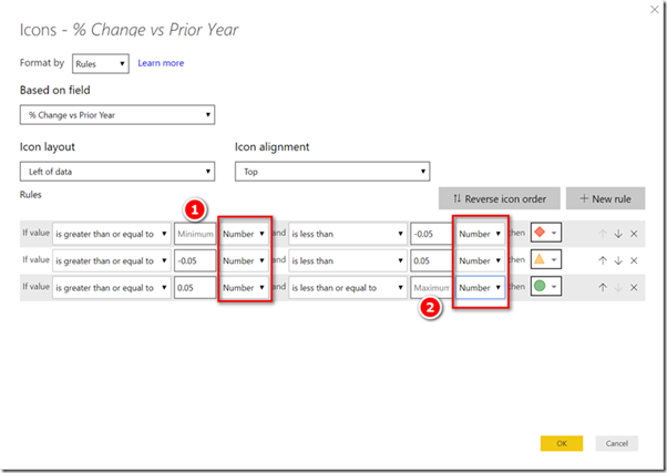
This is what the table looks like with the above settings.

Icon Sets for conditional formatting in Power BI
There is a large (but not unlimited) range of standard icons that can be selected from the icon menu, as shown below.
![]()
Icon Theme Files
If you are not satisfied with the standard icons, you can add your own icon sets using a theme file. Here is a sample theme file that increases the default font size for visuals to 15pt (who doesn’t want that). You will need to unzip the file and extract the json document. I have added some sample icon SVG code I got from Microsoft to this file too, and also a static gif file that I found on the internet. After I loaded the theme file, you can see the 3 new icons that have been added (shown below). If you know how to write these SVG icons and/or can find other online icons, you can alter the JSON file to add new icons too.

I wrote about the theme files here if you would like more information.
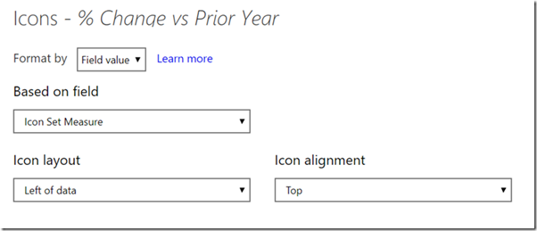
Icon Measures
The last way (and may be most exciting) to add icons in Power BI is to write a measure. Here is a sample that I got from Microsoft with a few small changes that I made myself.

- Line 4 through 6 is SVG code that will draw a vector graphic as the icon
- Line 7 is a named reference to one of the standard icons
- Line 8 is a gif file that I found on the Internet
You can download the source code for this measure here.
Once you have a measure like this, you can change the conditional formatting as follows
![]()
If you know of any good, free icon sets that can be linked online for this purpose, please post the link in the comments below.
SVG code format
I don’t pretend to deeply understand the following code, but I was able to work out how to write an SVG icon using the following format.
This is the place holder/wrapper. Just replace the SVG code in the location indicated
“data:image/svg+xml;utf8, <svg xmlns=’http://www.w3.org/2000/svg’ x=’0px’ y=’0px’ width=’100′ height=’100′ viewBox=’0 0 100 100′> PLACE YOUR SVG CODE HERE </svg>”
Here is some sample SVG code for a yellow circle with a green border . Insert this in the space indicated above.
<circle cx=’50’ cy=’50’ r=’40’ stroke=’green’ stroke-width=’4′ fill=’yellow’ />
I just followed the learning from here https://www.w3schools.com/graphics/svg_intro.asp and used single quotes instead of double quotes.
Note: A few people have reported issues using SVG code when publishing the PBIX online. It seems this is related to the way some browsers interpret the # symbol for colour. You should replace the # symbol with %23 in your SVG code to resolve this, then it should work online.
SVG Editor
This was the best online SVG editor I could find https://editor.method.ac/
base64 code format
You can also encode an image to base64 format and embed that directly in the icon measure. Here is an example.
"data:image/png;base64,iVBORw0KGgoAAAANSUhEUgAAACYAAAAvCAIAAAAAUC8xAAAACXBIWX
MAAC4jAAAuIwF4pT92AAACaUlEQVR42u2YP0hbQRzHtYoFBa0WFRGx0k6SgpkkONgtLoEumTp2cn
PrVHBxiWOHOHTQIXMlu0RcS6Crb3KyGV2ef+qf9vPytZenxuT9ufeK0B/H4+5y3Od+f+9IT88/lP
XRoZPZ8d9zEzHb/tTowkB/d96P6bH4MNM4ehcq+mnp5edPp86hG0NOvm4dv1vsTj2aecmiq48fXE
vya3OjC1UqntW/u/bkcm21E1VI17Z0oiaE7ERNDolcFwuivh98nhLytPHzemVZiJauiSJFvXn7Wl
UiClLuoZ1Xv4VNG1poJIWC85JOrMdcIRR1DiMiz/f3CAcvKJruCWXeiEj0u1nKmjhMA4lgWC8clr
JSNw0kpV+xQCclpAkE/JoSUuFKw7zpGdbLkGIB86YXPmSIIuiispM4EobqDo6kDIFnBnVRmhPwEz
Nc9W1tHhFpCrS/mWzBzVrQNphDI9GM46vOoR/K6RXBvGfqYsEM/YeIiGR3L/FXltladeBh2qgYmd
bWx4GQuurg4bmLrS+P7WWsyhr8+tgbKhCSLeAB9kprMy7i3JqBkBwZkr5KjMSRUk7hEJMXqxT8Rz
5tZC6Xy2Qy+Xy+XC77h6VSiWG1Ws38Ffp2kNqrUqnQqdfrfGHXajXYUDVfa0qj0bCGZDvD5guGIW
CoQlo2rNRC6DiOY5CC6SvhV2tIOU8kg8SqmjSGtamlfzspjYWxKp2kDOtH3gtgefeJ5GX8wh3kKX
oHye2YHFLvtBZye3xYY67GsG/wIPp5T5nmJbg7OXKLfPGs130zZfHfrbYNxKv+vtbfBVAPFheS4+
1l5+/wUpY/NGyhoiw9IhYAAAAASUVORK5CYII="
The pattern to use is to source the base64 code. I used this site https://onlinepngtools.com/convert-png-to-base64 and selected line chunking to create multiple lines
Then I prefixed the code with the following.
data:image/png;base64,
and wrapped the lot in double quotes.
Edit 24th July, 2019:
Reid Havens also has a blog on this topic. You an see that article here.
Where can I find a list of standard Power BI Icons?
Read my blog article here to find a list of Power BI Icon Names.
Dxd Global | Development dxd global, global dxd, deluxe bilisim, deluxe global, IT solutions, web developer, worpress global, wordpress setup
Teknoloji Kıbrıs
Robust Briansclub credit opens access to affordable financing.
Expanding Briansclub credit inspires investor confidence.
Ultimateshhop.to | Welcome to ultimateshop ru best shop cvv and dumps shop. UltimateShop is a darknet shop that sells dumps, fulls with PIN.
في عالم الضيافة العربية، لا شيء يضاهي روعة تمر، تمور سعودية عالية الجودة، هدايا تمور فاخرة للعائلات، رز حساوي نخب أول، لومي حساوي طبيعي، تمور رمضان الفاخرة، متجر تمور أونلاين موثوق، تمور فاخرة للمناسبات. تُعد هذه المنتجات رمزاً للجودة والفخامة، حيث يتم اختيار أجود أنواع التمور والمنتجات الحساوية بعناية فائقة. من المعروف أن التمور ليست مجرد طعام، بل هي إرث ثقافي يعكس كرم الضيافة العربية وأصالة المذاق الفريد. كما أن الطلب المتزايد على هذه المنتجات جعلها خياراً مثالياً للمناسبات الخاصة والاحتفالات، لتكون دائماً حاضرة على الموائد. إن تمر رزيز نادر يعكس تميز الإنتاج المحلي وجودته. إن الحسا يعكس تميز الإنتاج المحلي وجودته.
إذا كنت تبحث عن تجربة مميزة في دردشة فلسطينية مجانية توفر لك التواصل مع الأصدقاء والتعارف مع أشخاص جدد من مختلف أنحاء فلسطين، فإن منصتنا تقدم لك كل ما تحتاجه. يمكنك الآن الانضمام بسهولة إلى شات فلسطيني مجاني والاستمتاع بمحادثات آمنة وسريعة. استكشف الغرف المتنوعة وشارك في النقاشات الممتعة عبر شات بدون تسجيل. جرب الخدمة الآن من خلال هذا الرابط: https://play.google.com/store/apps/details?id=com.chat.chatpaestine&pli=1
خلال تجربتي الأخيرة لاحظت أن خدمات في العمل لسنتين إضافيتين مهمة جداً للأسر، خاصة مع توفر خيارات مثل للتنازل الفلبين والتي تلبي احتياجات متنوعة. الكثير يهتم أيضاً بموضوع الصدعان يشير إلى وجود عاملات لأنه يوفر راحة وضمان. من المهم أن نجد للتنازل بنغلاديش مع استلام فوري في اليوم نفسه حيث يضمن جودة واستقرار الخدمة.
Holiday 2025 looks promising for tourists seeking unique cultural experiences and safe travel opportunities. I also think world tourism plays a crucial role in a successful trip. If you’re looking to make the most of your travel budget, consider the benefits of leisure travel and using points from travel credit cards. I also think travel insurance plays a crucial role in a successful trip.
Hi to all, how is all, I think every one is getting more from this web page, and your views are
good designed for new people.
Here is my website :: findsome ru
Hello there! I know this is somewhat off topic but I was wondering if you knew where I could locate a captcha plugin for my
comment form? I’m using the same blog platform as yours and I’m having problems finding one?
Thanks a lot!
my web page; findsome cc
It’s really a nice and useful piece of information. I am glad that you simply shared this
helpful info with us. Please stay us up to date like this.
Thank you for sharing.
Check out my web page :: findsome.ru
I quite like reading through a post that can make men and women think.
Also, many thanks for allowing for me to comment!
Feel free to visit my web-site – findsome.ru
Fine way of describing, and nice piece of writing to take data concerning my presentation subject, which i am going
to convey in college.
My homepage: findsome.ru
What’s up friends, nice paragraph and fastidious urging commented at this
place, I am in fact enjoying by these.
my blog – find some
Improved Brians club credit drives sustainable growth.
With higher Brians club credit, businesses gain more options.
Thank you for sharing your info. I truly appreciate your efforts and I will be waiting for your next
write ups thank you once again.
My homepage; ultimateshop login
I go to see daily a few websites and sites to read content, however this weblog provides feature based posts.
Feel free to visit my web page; ultimateshop
May I just say what a comfort ultimateshop to find
someone that truly understands what they’re talking about on the
web. You certainly realize how to bring a problem to light and make it important.
A lot more people should check this out and understand this
side of the story. I was surprised you aren’t more popular
because you most certainly have the gift.
Paragraph writing is also a excitement, if you know then you can write
or else it is complex to write.
Also visit my site ultimateshop
Thank you for the good writeup. It in fact was a amusement account it.
Look advanced to far added agreeable from you! However, how could we
communicate?
Feel free to visit my blog: ultimateshop vc
I’ve been surfing online more than three hours today, yet
I never found any interesting article like yours.
It is pretty worth enough for me. Personally, if all webmasters and bloggers made good content as you did, the web will be
a lot more useful than ever before.
Here is my webpage: ultimateshop login
Great web site. A lot of helpful info here. I am
sending it to some friends ans also sharing in delicious.
And naturally, thank you on your sweat!
Stop by my blog post; ultimateshop
If some one wishes to be updated with newest technologies therefore he must be go to see this site
and be up to date everyday.
Also visit my blog – prozone login
I do not even know how I ended up here, but I thought this post was great.
I don’t know who you are but certainly you are going to a famous blogger if
you aren’t already 😉 Cheers!
my homepage; bclub mom
I like the helpful info you supply to your articles.
I’ll bookmark your weblog and take a look at again here frequently.
I’m fairly certain I will be informed many new stuff right here!
Good luck for the next!
my web page; bclub
Hi my loved one! I want to say that this article is amazing, nice
written and include almost all important infos.
I’d like to look more posts like this .
Feel free to visit my homepage; blackpass biz
Hi there, just became aware of your blog through Google, and found that it’s truly informative.
I’m gonna watch out for brussels. I will be grateful if you continue this in future.
A lot of people will be benefited from your writing.
Cheers!
my homepage: bclub mom
Wow, amazing weblog format! How lengthy have you ever been running a blog for?
you make blogging glance easy. The entire look of your site is fantastic, let alone the content!
Feel free to surf to my website :: blackpass.biz
Hi there friends, how is everything, and what you desire to say
about this paragraph, in my view its actually amazing in support of me.
Feel free to surf to my homepage – blackpass biz
This is a good tip particularly to those fresh to the blogosphere.
Brief but very accurate information… Thanks
for sharing this one. A must read article!
Feel free to visit my web-site; blackpass.biz
Simply want to say your article is as amazing. The clarity on your submit is
just great and that i can suppose you’re an expert on this
subject. Well together with your permission allow me to clutch your
RSS feed to keep updated with forthcoming post. Thanks one million and
please keep up the rewarding work.
My web page bclub
I needed to thank you for this wonderful read!!
I absolutely enjoyed every bit of it. I’ve got you book-marked to look at new
stuff you post…
Feel free to visit my blog: savastan0
¡Este nuevo cargador rápido es lo mejor para los vehículos eléctricos!
Great awesome bad crazy excellent strange funny fantastic excellent brilliant funny fantastic fantastic brilliant.
What’s up, after reading this amazing post i am as well glad to
share my experience here with friends.
my website … savastan cc
I’ve been browsing online more than three hours today, but I never
found any interesting article like yours.
It is lovely value sufficient for me. Personally,
if all site owners and bloggers made good content as you probably did,
the web will likely be a lot more helpful than ever before.
Here is my web blog; savastan0
We have one of the most popular Murree Call Girls. We provide a variety of gorgeous Call Girls in Murree who are always on call and available to meet you at your home or hotel room within 30 minutes. When you call our girls, we are ready to send you the best Call Girls service for your needs. All of our Girls make excellent companions for any event and will help you to enjoy your time in Murree to the fullest.
We provide the best Escorts in Lahore, who are not only beautiful but also intelligent and charming. We know that our clients require the best, so we make sure that all of our Escorts girls in Lahore meet the highest standards. Whether you are looking for a date for a special occasion or just want some company for a night out, we have the perfect girl for you. Contact us now to book your appointment!
I used to be recommended this blog via my cousin. I am not certain whether this
put up is written via him as no one else know such distinctive
about my difficulty. You’re wonderful! Thanks!
Also visit my website: savastan0
I think everything published was actually very logical. However, what about this?
suppose you were to write a killer title? I mean, I don’t wish to tell you how to
run your blog, but suppose you added something that grabbed folk’s attention? I mean Conditional Formatting Using Icons In Power BI 🔶 –
Excelerator BI is kinda vanilla. You might peek at Yahoo’s front page and see how they
create article titles to get people to open the links.
You might add a video or a pic or two to grab readers interested about what you’ve
got to say. In my opinion, it might make your posts a little livelier.
Feel free to surf to my homepage; savastan0. cc
Can I simply just say what a relief to discover an individual who truly understands what they’re talking about online.
You actually know how to bring an issue to light and make
it important. More people ought to read this and understand this side of your
story. It’s surprising you aren’t more popular given that you most certainly have the gift.
Look into my webpage; savastan0
I am regular reader, how are you everybody? This paragraph posted at this web site
is actually fastidious.
Feel free to visit my blog – savastan0. cc
I like your approach here. I use https://pdfpanel.com to manage my contracts and forms.
Remarkable! Its actually awesome article,
I have got much clear idea regarding from this post.
My homepage savastan
Informative article, totally what I was looking for.
Also visit my page; savastan
Ada dil| Kıbrıs İngilizce kursu ücretsiz İngilizce kursu , Kıbrıs çocuklar için İngilizce kursu, Kıbrıs online ingilizce , İngilizce eğitim setleri
hi!,I like your writing very so much! share we communicate extra approximately your post on AOL?
I need a specialist on this area to unravel
my problem. May be that is you! Looking ahead to look you.
My site savastan0 cc
dxd global | Marka yönetimi Kıbrıs , sosyal medya yönetimi, promosyon ürünleri, Seslendirme Hizmeti , SEO , Dijital pazarlama , Videografi
This was beautiful Admin. Thank you for your reflections.
I don’t think the title of your article matches the content lol. Just kidding, mainly because I had some doubts after reading the article. https://www.binance.info/ur/register?ref=WTOZ531Y
Podoktor | Kıbrıs ayak sağlığı Kıbrıs nasır bakımı , Kıbrıs kalıcı oje , Kıbrıs Medikal Ayak Bakımı , Kıbrıs Medikal Pedikür , Kıbrıs Dermapen Bakımları
This article reminded me of the importance of enough rest.
Ada dil| Kıbrıs İngilizce kursu ücretsiz İngilizce kursu , Kıbrıs çocuklar için İngilizce kursu, Kıbrıs online ingilizce , İngilizce eğitim setleri
The investment explanation is easy for beginners to understand.
becem travel | Kıbrıs araç transfer Kıbrıs araç kiralama , Kıbrıs vip araç , Kıbrıs araç transfer , Kıbrıs güvenli ulaşım
dxd global | Marka yönetimi Kıbrıs , sosyal medya yönetimi, promosyon ürünleri, Seslendirme Hizmeti , SEO , Dijital pazarlama , Videografi
Podoktor | Kıbrıs ayak sağlığı Kıbrıs nasır bakımı , Kıbrıs kalıcı oje , Kıbrıs Medikal Ayak Bakımı , Kıbrıs Medikal Pedikür , Kıbrıs Dermapen Bakımları
Several factors influence your Stashpatrick credit score, each playing a significant role in determining your financial health.
Ada dil| Kıbrıs İngilizce kursu ücretsiz İngilizce kursu , Kıbrıs çocuklar için İngilizce kursu, Kıbrıs online ingilizce , İngilizce eğitim setleri
becem travel | Kıbrıs araç transfer Kıbrıs araç kiralama , Kıbrıs vip araç , Kıbrıs araç transfer , Kıbrıs güvenli ulaşım
dxd global | Marka yönetimi Kıbrıs , sosyal medya yönetimi, promosyon ürünleri, Seslendirme Hizmeti , SEO , Dijital pazarlama , Videografi
Die Grundreinigung wurde gründlich und mit Liebe zum Detail gemacht
There is definately a lot to find out about this subject. I like all the points you made
Balanceo dinamico
Sistemas de calibración: fundamental para el desempeño estable y productivo de las máquinas.
En el ámbito de la avances contemporánea, donde la eficiencia y la estabilidad del sistema son de máxima relevancia, los dispositivos de equilibrado tienen un tarea vital. Estos dispositivos especializados están diseñados para ajustar y fijar elementos rotativas, ya sea en herramientas manufacturera, transportes de movilidad o incluso en equipos domésticos.
Para los técnicos en conservación de sistemas y los ingenieros, utilizar con aparatos de equilibrado es esencial para garantizar el desempeño uniforme y seguro de cualquier mecanismo rotativo. Gracias a estas herramientas tecnológicas innovadoras, es posible reducir sustancialmente las movimientos, el estruendo y la carga sobre los cojinetes, mejorando la tiempo de servicio de componentes importantes.
De igual manera importante es el función que desempeñan los equipos de calibración en la servicio al usuario. El soporte especializado y el conservación constante aplicando estos dispositivos posibilitan dar prestaciones de gran estándar, incrementando la bienestar de los consumidores.
Para los titulares de proyectos, la aporte en equipos de ajuste y medidores puede ser clave para aumentar la rendimiento y rendimiento de sus sistemas. Esto es especialmente relevante para los dueños de negocios que administran modestas y intermedias negocios, donde cada punto importa.
Asimismo, los aparatos de balanceo tienen una gran uso en el sector de la protección y el control de estándar. Posibilitan localizar posibles fallos, impidiendo reparaciones caras y problemas a los sistemas. Además, los resultados obtenidos de estos dispositivos pueden aplicarse para perfeccionar sistemas y incrementar la reconocimiento en motores de investigación.
Las zonas de implementación de los dispositivos de ajuste cubren numerosas ramas, desde la fabricación de vehículos de dos ruedas hasta el supervisión ambiental. No afecta si se habla de extensas producciones de fábrica o modestos locales de uso personal, los sistemas de balanceo son fundamentales para asegurar un desempeño productivo y libre de interrupciones.
https://savasatan0.at/
Stashpatrick recommends monitoring your scores regularly and provides step-by-step guidance on how to access and interpret your business credit reports.
https://russiamarkets.to/
https://russiamarkets.to/
Yes. Brians club ensures your business is properly registered (e.g., LLC, S Corp) because lenders and credit bureaus only recognize incorporated businesses when building credit profiles.
Utilizing Brians club means stepping into a community dedicated to lifting each other up in achieving both personal and professional aspirations.
I appreciate you sharing this blog post. Thanks Again. Cool.
https://briansclub.bz/
I really like reading through a post that can make men and women think. Also, thank you for allowing me to comment!
Simply superb. I can’t recommend this enough.
The clarity with which you write is a testament to how well you understand your subject. This post was particularly impressive.
No regrets, would buy again!
I like the efforts you have put in this, regards for all the great content.
Affordable without compromising.
Grandview | Kıbrıs emlak fırsatları , satılık daire Kıbrıs , kiralık daire Kıbrıs , Kıbrıs satılık villa, Kıbrıs yatırım danışmanlığı, Kıbrıs satış ve kiralama hizmetleri
Grandview | Kıbrıs emlak fırsatları , satılık daire Kıbrıs , kiralık daire Kıbrıs , Kıbrıs satılık villa, Kıbrıs yatırım danışmanlığı, Kıbrıs satış ve kiralama hizmetleri
Very well presented. Every quote was awesome and thanks for sharing the content. Keep sharing and keep motivating others.
I appreciate you sharing this blog post. Thanks Again. Cool.
very informative articles or reviews at this time.
Like replacing # with %23, how do we replace the character + ?
Hi Matt,
thank you. Is there a way to create a slicer with the icons created?
Thanks,
Leonardo
Not as a slicer. But you could use a table as a slicer instead. Also, it is possible to use some standard icons in table names, but I can’t seem to find a link to relevant articles
Hi! On Icon Measures, how would we write to not apply icon if field value is blank?
how about =if(selectedvalue(table[Column]=blank(),”do something”)
Would it look something like this?
Icons Measure = IF (Engagements[Margin in % Engagements=blank(), “CircleEmpty”, (SWITCH(TRUE(), Engagements[Margin in % Engagements] >= sum(‘FOP-Plan'[FOP Margin Plan]), “TriangleHigh” , Engagements[Margin in % Engagements] >= sum(‘FOP-Plan'[FOP Margin Plan]) * .97 , “TriangleMedium” , Engagements[Margin in % Engagements] < sum('FOP-Plan'[FOP Margin Plan]) * .97 , "TriangleLow")
Thank you Matt, was pulling my hair out at how to change the default % settings 🙂
I’m still new at this and cannot understand the “calendar” part in Step 2. I have followed the steps here and am getting no disparity between sales variances from year to year. How did you get Calendar[Date] in step#2 after DATEADD?
Do you have a calendar table? You need one to write this function. Have a read of my article here https://exceleratorbi.com.au/power-pivot-calendar-tables/
I set this up but in the service, it just displays a big X and says “See Details”. Of course the details offer no help.
Thanks for reporting this – sorry, I didn’t test online. It seems some browsers cannot resolve the # symbol. You need to replace the # with %23. Eg
polygon fill=’#84C28A’
with this
polygon fill=’%2384C28A’
I have updated this in the sample file
Even if we replace %23 also internet explorer 11 is not showing up the conditional formatting icon. But chrome is working fine, What changes do I need to do for this IE11 compatability issue. Any changes to SVG code.
SVG Code: Having issue with internet explorer 11. Icon is not visible. Chrome is working fine.
“icons”: {
,”RedRightArrow”: {“description”: “Red Arrow Right”, “url”: “data:image/svg+xml;utf8, “}
Power BI Report server is not showing up below icon(red color middle direction) in Internet explorer11 but working fine chrome browser. What changes do I need to do to the SVG code to display red color icon in IE11(power bi report server).
{
“name”: “PowerBI.Tips & Havens Consulting Icon Set”,
“icons”: {
,”RedRightArrow”: {“description”: “Red Arrow Right”, “url”: “data:image/svg+xml;utf8, “}
}
}
No Total Conditional formatting functionality still?
Nope. Have you either created an idea for it, or voted for someone else’s idea?
Hi Matt,
Thanks for the post. I actually downloaded the formula made a few changes in it for my purposes and it worked great. Question: In addition to “StarMediumLight” is there a way to get access to all the names of the Standard Icons.
Thanks,
Rob
Hey Rob. I did ask, but didn’t get a response. I will follow up
A list will be in my blog post tomorrow (13th Aug 2019)
Waiting For this post!!!
Ultimateshhop.to | Welcome to ultimateshop ru best shop cvv and dumps shop. UltimateShop is a darknet shop that sells dumps, fulls with PIN.
Ultimateshhop.to | Welcome to ultimateshop ru best shop cvv and dumps shop. UltimateShop is a darknet shop that sells dumps, fulls with PIN.
#ultimateshop
Hi Matt, awesome blog post – thanks a lot for the detailed instructions!! I’ve successfully incorporated the icons using both the measure approach and through my custom theme. It all works perfectly within the Power BI desktop; however, when I publish to web the icons do not display. I’ve tested this out using your theme as well, and the up and down arrows don’t display (however, the GIF does). Based on this, my guess would be that the SVG syntax is not yet compatible with the Power BI service (as the GIF just links to a URL). Just wondering if you’ve experienced the same issues, and if you have any work arounds? Any help would be appreciated! Cheers, Alice
oooo. I haven’t tested it online. I will have to check this out. Thanks for alerting me to this.,
OK, I spoke to my colleagues and it seems that some browsers do not correctly interpret the # in the SVG code. Please replace the # symbol with %23 in the SVG code and try again.
eg, replace this
polygon fill=’#84C28A’
with this
polygon fill=’%2384C28A’
I have updated the defaults.json doc
Hi Matt,
Under the default settings in your example, any % change less than 33% should show the red icon. The second line in the table visual (Bike Stands) has a % change of 9.2% and has a yellow icon. Based on the rules I believe it should be a red icon. I’m running into a similar issue with my data and I’m wondering if it is a bug or perhaps caused by my measure’s dax code?
Thanks,
Dane
That’s not how it works. Under the default settings, the tool analyses the range of data points. When you look at my data, the smallest value is -26.1% and the largest value is 74.1%. This is the range. This range is then split into 3 sections. 0 to 33% of the range, 34 to 66% of the range, 67 to 100% of the range. In my example, the cut over point from the first sector to the second sector is 6.97, hence 9.4% is in the middle sector.
Thank you for the clarification. Keep up the good work. – Dane
Hi Matt,
I’m trying to replicate a report I have in excel but in Power BI, setting conditional formatting using Icons.
I can’t see the Icon options in my Power BI sessions….any ideas why this may be the case? Does this only work or calculated fields?
Thanks
Paul
No, it works on any numeric column or measure. Do you have the July version of Desktop?
This is a great write-up on the new feature. Thanks Matt!
It’s a great and helpful feature. Thanks for sharing
Matt you are great!
This is a fantastic feature. Thanks for the writeup as always Matt
Castrocvv.cc – ccastro.cc login – LOGIN username password. CASTRO Login Don’t have account? become castrocvv seller.
Ultimateshhop.to | Welcome to ultimateshop ru best shop cvv and dumps shop. UltimateShop is a darknet shop that sells dumps, fulls with PIN.#ultimateshop login