The team at Power BI is setting a blistering pace of updates and improvements for PowerBI.com and Power BI Desktop. One of the great improvements in the November 2015 update is the ability to control how cross filtering between charts (and other objects) on the canvas works. The default cross filtering between charts has been on my list of things I hate about Power BI – this list is now getting very short very quickly. Seriously, I will have nothing to complain about soon :-). Let me show you the before and after behaviour.
The default cross filtering
This is the way it has always worked up until now. Note that when I click on the chart on the left below, the chart on the right cross filters and visually shows the percentage of the original mix.
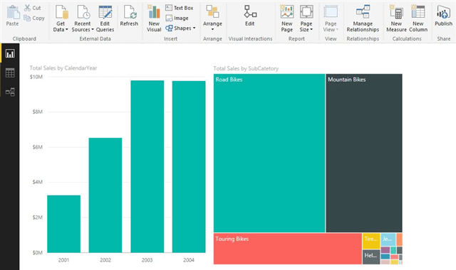
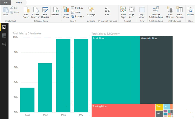
There may be times when you want this behaviour, but most times I don’t want this. In the example above, the chart on the right is a TreeMap. The TreeMap visualisation is specifically designed to illustrate the relative share between items in the set. Adding another dimension in the form of a “percentage of orginal mix” just doesn’t make sense to me, and I think the visualisation just doesn’t work well like this – there is too much going on. What I want to see is the tree map on the right reshaping to show me the share of products for the selected year selected on the left. Fortunately there is now a way to configure this for each object in your Power BI report. After I have made the configuration change in Power BI Desktop it looks like this – much better in many cases (IMO).
How to configure this feature
The configuration of this new feature is pretty easy. First of all set up a Power BI report with at least 2 chart objects (or tables, or any other visualisation). Then do the following.
- Click on the new Edit button that appears under “Visual Interactions”.
- Select one of the charts (I have selected the one on the left).
- All other charts on the page will then show a set of 3 icons (shown as 3 below).

- If you select the pie chart icon, it will visually filter the original chart using shading to show the new share – this was the original behaviour.
- If you select the filter icon, the entire chart will refresh for the sub set of data. This is the new behaviour and the one that I much prefer.
- If you select the third icon (the ghost busters sign), then the chart will not filter at all.
After you have selected the behaviour you want, you can click the Edit button again (1 above) and these icons will disappear. It is possible to set the cross filter behaviour of every single chart on your canvas exactly as you want to see it for cross filtering from every other chart – complete granular control – just the way I like it.
Great job Power BI team – keep it up. My “hate list” is getting shorter by the month.

Hi, Neat post. There’s an issue with your website in internet explorer, might check this?K IE nonetheless is the marketplace leader and a large element of folks will leave out your magnificent writing because of this problem.
Thanks for sharing this — loved how you explained the “before and after” behavior. On a related note, Power BI users who want more control over filtering and interactions might find the Inforiver Superfilter helpful. Here’s a link if you’d like to explore:
https://inforiver.com/super-filter/
It is truly a great and helpful piece of info. I¦m satisfied that you shared this helpful info with us. Please keep us up to date like this. Thank you for sharing.
Pretty section of content. I just stumbled upon your website and in accession capital to assert that I get in fact enjoyed account your blog posts. Any way I will be subscribing to your augment and even I achievement you access consistently rapidly.
I have been reading out many of your stories and it’s pretty nice stuff. I will surely bookmark your blog.
Hello my family member! I wish to say that this post is amazing, great written and include approximately all significant infos. I¦d like to peer extra posts like this .
Hello There. I found your blog using msn. This is a very well written article. I’ll make sure to bookmark it and come back to read more of your useful info. Thanks for the post. I will definitely comeback.
obviously like your website but you need to check the spelling on several of your posts. Several of them are rife with spelling problems and I find it very bothersome to tell the truth nevertheless I’ll definitely come back again.
I was very pleased to find this web-site.I wanted to thanks for your time for this wonderful read!! I definitely enjoying every little bit of it and I have you bookmarked to check out new stuff you blog post.
I really like your writing style, good info , thankyou for posting : D.
Thank you for the good writeup. It in fact was a amusement account it. Look advanced to far added agreeable from you! By the way, how can we communicate?
Thank you, your article surprised me, there is such an excellent point of view. Thank you for sharing, I learned a lot. http://btc-uah.cryptostarthome.com
I don’t normally comment but I gotta tell thanks for the post on this great one : D.
Some genuinely fantastic info , Glad I discovered this. “To be conscious that we are perceiving or thinking is to be conscious of our own existence.” by Aristotle.
demais este conteúdo. Gostei muito. Aproveitem e vejam este conteúdo. informações, novidades e muito mais. Não deixem de acessar para saber mais. Obrigado a todos e até a próxima. 🙂
me encantei com este site. Para saber mais detalhes acesse nosso site e descubra mais. Todas as informações contidas são conteúdos relevantes e diferentes. Tudo que você precisa saber está está lá.
I truly appreciate this post. I have been looking everywhere for this! Thank goodness I found it on Bing. You’ve made my day! Thx again!
I’ll right away grab your rss as I can not find your email subscription link or e-newsletter service. Do you’ve any? Please let me know in order that I could subscribe. Thanks.
I was looking at some of your posts on this site and I think this internet site is very informative! Keep posting.
I went over this web site and I conceive you have a lot of excellent information, saved to my bookmarks (:.
The heart of your writing whilst sounding reasonable in the beginning, did not really sit perfectly with me personally after some time. Somewhere throughout the sentences you were able to make me a believer but only for a while. I however have a problem with your jumps in assumptions and you would do well to fill in all those gaps. In the event that you actually can accomplish that, I would definitely end up being amazed.
Hi Matt, I just read this post and I am loving it! 🙂