Level: Intermediate
Matt: This is the second one in a series of articles from Parker Stevens. In this article he talks about using R with Power BI. If you missed his first article “Introduction to DirectQuery” you can read it here.
Parker: Power BI comes with a ton of built-in features but eventually you might find yourself wanting more. I sometimes see people asking for certain charts and functionality when the reality is that you can build them for yourself in just a few lines of R code. R is a statistical programming language that has been around for quite some time. R is mainly used for performing statistical analysis, machine learning, and data visualization. With a large number of plotting packages, R allows anyone to create awesome visualizations that aren’t available out of the box in Power BI. In this post, I’m going to show you how to set up R on your machine and share with you two of my favorite R visuals that can be written in just a few lines of code.
In the first couple of sections we are going to cover installing and setting up R in Power BI and quickly walk through the basics of how to use an R visual. If you already have R set up or are familiar with the process to bring data into an R visual, please skip down to the “3D Scatter Plot” section to jump right into writing the R code.
Installing R and Configuring in Power BI
If you are going to use R with Power BI, you first need to install R as a separate application on the same PC as you use with Power BI Desktop. Once installed, it can be used directly from within Power BI Desktop. The required R application can easily be installed in just a few clicks. Assuming you’re using Power BI on Windows, you can download the required R application from here https://cran.r-project.org/bin/windows/base/.
This link allows you to install the 32-bit version on 32-bit computers and both 32-bit and 64-bit versions on 64-bit computers. I also recommend installing R Studio in order to make writing and learning R a whole lot easier. While not required, R Studio is an integrated development environment (IDE) that helps by providing auto-complete syntax for the basic R language and any packages you might be using. You can download it here (select the free, open source version) https://www.rstudio.com/products/rstudio/
Once you have R installed on your machine, hop over to Power BI Desktop and open up Options (#1 below). Click on “R Scripting” (#2 below) and make sure it is pointing to your newly installed R program under “Detected R home directories” (#3 below). Mine was installed to C:\Program Files\R\R-3.5.1 as shown below. If it hasn’t picked up the program location automatically, find R on your machine and enter the path.

If you downloaded R Studio, make sure that it is showing up under “Detected R IDE’s” (#4 above). Again, this isn’t necessary but can be helpful.
How to Use an R Visual
Before we jump into some fun and useful visuals, let’s take a second to understand how to bring one into your report. Click on the blue “R” in the Visualizations pane. If this is your first time using an R visual in the current report, it will ask if you want to “Enable script visuals”.
**IMPORTANT** Clicking Yes will allow whatever R code is present in the PBIX to run on your machine. R is a versatile language that can be used to run different kinds of scripts on your computer. Therefore, only select Yes if this is a new Power BI workbook or if you trust the file that you are viewing.
For our purposes, you can select yes and an interesting visual will appear.
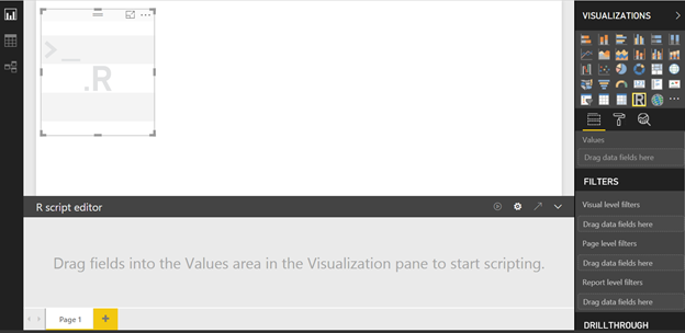
A blank visual appears along with an R script editor on the bottom. However, you can’t do anything with either of these until you add a column into the Values placeholder of the visual.
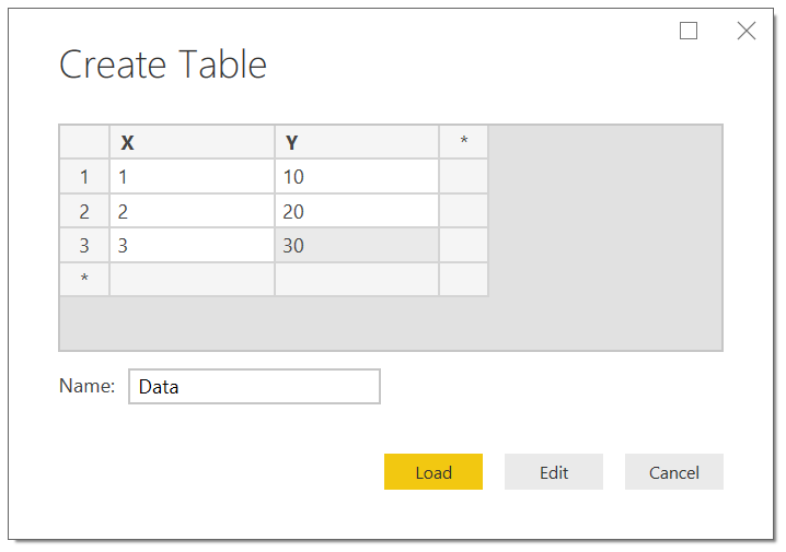
For a quick demonstration, I am going to enter in some data to use in the visual. I’m simply clicking the “Enter Data” button and typing in the data and then clicking “Load.”
Next, I am bringing in both columns from my new table into the R Visual (I placed X and Y into Values and set their aggregation to “Don’t summarize” similar to how you would for a normal scatter plot or table visual). This opens up the editor and now allows you to start typing R code.
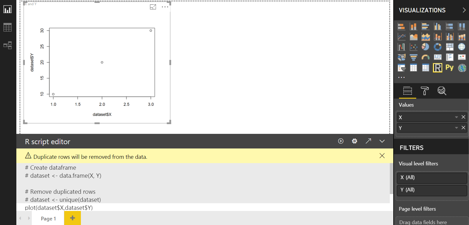
By default, the field or fields that you are passing into the R visual will be represented in what is called a “dataframe” in R. This is basically a table of data and ours has been automatically named “dataset.” The first 4 lines of code in the image above are comments about the data and were automatically created by R and Power BI.
In order to access the data that I loaded in the table, I simply need to type refer to their R columns names in the following format: dataset$X and dataset$Y.
In this quick example, I typed the following R code to plot X against Y. Plot is a simple R function that will plot the data from the 2 columns in the table onto a chart. Note that R is a case sensitive language, so may sure you type the commands exactly as shown.
plot(dataset$X, dataset$Y,type=”o”)
It is so easy to display a graph in R! For documentation about the plot function, take a look here https://www.rdocumentation.org/packages/graphics/versions/3.6.2/topics/plot
If you type in code that does not result in a plot of some sort, the visual will produce an error. Now that you know how to bring in an R visual, pass in a column from your data model, and create a plot, let’s dive into a couple of fun examples of plotting in R.
3D Scatter Plot
I love scatter plots for their ability to disclose a ton of information in a small amount of space. Scatter plots in Power BI are restricted to 2D visualizations which is pretty standard. However, in R, we can create a three-dimensional representation of a scatter plot with very minimal effort on our part. The reason this is easy for us is because we can use code others have already written, bundled into what is called a “package”, that is available for download and use in our script. In this example, we will create this 3D scatter plot with the ability to rotate the visual to view the model from different perspectives.
Let’s get started by importing some data. For this next section, I am launching RStudio. If you installed RStudio you can follow along. Lucky for us, simply installing R provides a ton of datasets to practice plotting. To view which datasets are available, type data() into the R command prompt from RStudio.
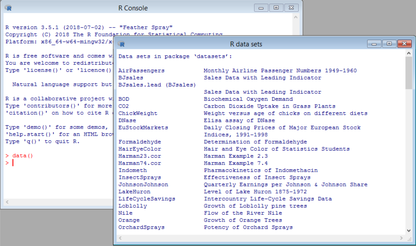
The list of datasets is visible in RStudio as shown above. To access one of these datasets from Power BI, you will need to go back to Power BI Desktop, click on Get Data, click on Other (#1 below) and then double-click on R script (#2 below). At this stage, we are about to run an R script inside of Power Query as a way to load data into our model. I would like to make it clear that there are only two places within Power BI that you can run R scripts. 1) Within Power Query (as in this example) and 2) Within an R Visual (a little later in the post).

This opens up another editor to type in R code. In this instance all you need to type is data(iris) and click on OK.
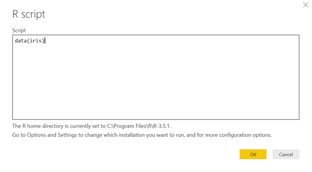
This will load the built-in Iris dataset, a popular dataset that has been in use since the 30s. This data explains the differences amongst separate species of flowers. We will use it because the data is grouped into three, well-defined classes that will be easily viewable in the scatter plot.
Select the “iris” table (#1 below) and click on Load (#2 below). The iris table of data will now be available to you in your data model. As you can see, we have data for the sepal lengths and width, petal length and width, and species.

Let’s create a new R visual using this sample dataset just loaded, this time bringing in Sepal.Length, Sepal.Width, Petal.Length, and Species into Values. Any columns that you need to use in your plot must be added to the Values section of the visual. You can also have other columns in your table that are not used for a specific visual too. For this demo, you need all four columns in the Values section so they are available to use in the visual/plot.
Before going any further, we need to install the scatterplot3d package which will allow us to call some pre-defined functions to make the process easier. Open and run a new instance of R directly on your PC (not from within Power BI). Your R download included an executable file where you can do this. Mine was found at the following path: C:\Program Files\R\R-3.5.1\bin\R.exe. After launching the R program above, type
install.packages(“scatterplot3d”)
and click on the Enter key. The line of code above is R script – pretty easy to see what it does, right?

Now the package has been installed, it will be available for you to use now and anytime in the future. Jumping back to Power BI, type in the following code in the R script editor at the bottom of the visual (this is R script again).
library(scatterplot3d)

x <- dataset$Sepal.Length

y <- dataset$Sepal.Width

z <- dataset$Petal.Length

scatterplot3d(x,y,z,

color=as.numeric(dataset$Species),

pch=19,

xlab="Sepal Length",

ylab="Sepal Width",

zlab="Petal Length")
This may look like gibberish at first, but it becomes easy to understand after a little while.
First (line 1) we are importing our new package by calling library(scatterplot3d). A package is just a set of pre-prepared code that will do a specific task – in this case it creates the ability to create a scatter plot in 3D. This first line of code allows us to use the scatterplot3d functions but does not add anything to the Power BI model. We are simply importing the package within the script for 1-time use each time the visual is run.
Next (lines 3, 4, 5) we are assigning one of the columns from the data to one axis (either x, y, or z).
Finally (remaining lines) we are plotting the 3D scatter plot with x, y, and z, along with a few other parameters. The color parameter colors the points based on the species of flower. PCH stands for plot character, and a value of 19 makes each point a large, solid circle. And finally, the xlab, ylab, and zlab parameters create the axis labels.
Note that the scatterplot3d() function is the only code that is specific to the scatterplot3d package; everything else is the native R language. Click the run button (looks like a play button) and behold your 3D scatter plot! It’s pretty neat already, but let’s add the finishing touch to allow a slicer selection to rotate the model.
Matt recently shared a post that showed how to use What If Parameters. We are going to do the same here. Create a new What If Parameter and set it up like the following.
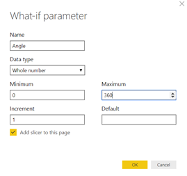
Click OK and you should have a new table named “Angle” in the data model as well as a new slicer on your report. Click the little dropdown arrow on the slicer and select “Single Value.”
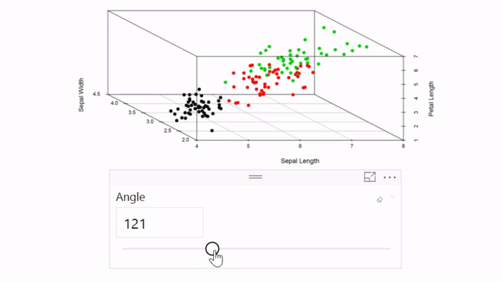
Finally, add the new Angle column (the column, not the measure) to your list of fields in the R visual. When you add the Angle column, make sure you select “Average” as its method of summarization. Finally, we’ll add one line of code to use this new Angle field and we’ll end up with the following code:
library(scatterplot3d)

x <- dataset$Sepal.Length

y <- dataset$Sepal.Width

z <- dataset$Petal.Length

scatterplot3d(x,y,z,

color=as.numeric(dataset$Species),

pch=19,

xlab="Sepal Length",

ylab="Sepal Width",

zlab="Petal Length",

angle=dataset$Angle[1])
Now take a look at the interactive 3-D model you’ve created! Click around with the slicer and view the model from different perspectives to get a feel of the three dimensions.
Here’s a video walking through the whole process:
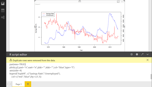
Dual Y-Axis Line Chart
Let’s finish up this post with a quick example of how to code the elusive line chart with two y-axes. This always seems to be asked in the forums and it’s pretty easy to implement.
Follow the same steps as shown above to bring in a new R visual. Since we need a column to pass into the visual and open up the editor, let’s just throw in the Angle field that we made previously. With the code editor available we can start writing the R script. In this example, we are going to need some data that is available in a specific R package, called “ggplot2.” Go ahead and install the package by typing the following code the same way we installed scatterplot3d:
install.packages(“ggplot2”)
Once that’s installed, we will call the library and import the “economics” dataset. This built-in dataset shows cool trends of economic data such as personal savings rate and unemployed population over time. In these first couple of steps, we are going to assign the “date” column to be our X dimension, “psavert” (personal savings rate) will be our first y-axis, and “unemploy” will be our second y-axis. Since we need to plot something in order to avoid the R visual throwing an error, we can call the basic plot command with some parameters for formatting.
library(ggplot2)
data(“economics”)
x <- economics$date
y1 <- economics$psavert
y2 <- economics$unemploy
plot(x,y1,col=”red”,type=”l”,ylab=”Savings Rate %”, xlab=”Year”)
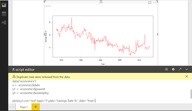
Off to a good start. Let’s now add the second y-axis. You do this by calling the par() function which will allow you to plot another series on top of the existing one. Input the following finished code into your R visual and we’ll walk through the additional lines that we added.
library(ggplot2)
data(“economics”)
x <- economics$date
y1 <- economics$psavert
y2 <- economics$unemploy
plot(x,y1,col=”red”,type=”l”,ylab=”Savings Rate %”, xlab=”Year”)
par(new=TRUE)
plot(x,y2,yaxt=”n”,xaxt=”n”,ylab=””,xlab=””,col=”blue”,type=”l”)
axis(side=4)
legend(“topleft”, c(“Savings Rate”,”Unemployed”),
col=c(“red”,”blue”),lty=c(1,1))
We already know what the par function achieves. Next we are creating another plot but this time using the “y2” series that we previously set up with the unemployed data. There are a couple of plotting parameters added to pretty it up. Basically, the yaxt, xaxt, ylab, and xlab parameters are there to erase all axis labels and tick marks. Next, the axis() function is called where “side=4” is specified, bringing up the y-axis tick marks on the right side of the graph. Finally, we call the legend function to differentiate the two series by color. And here’s the finished product:
Pretty neat and not too many lines of code. If you’ve ever complained to Microsoft about how they need to add a line chart with two axes, here’s a DIY solution!
Again, here’s a video walkthrough:
Conclusion
I hope you enjoyed this quick walkthrough of how to use R visuals to extend the base functionality of Power BI. I find that if Power BI is lacking a certain visual that I need for a project, building the visual manually in R is always a fun experience with a good payoff. Recently, Power BI added Python to the list of languages available to use. The general methods of running scripts via Power Query and inside of the visual can be applied to Python scripts as well! Happy coding!
정신적 여유가 그리울 때, 토닥이에서 나를 위한 쉼을 경험하세요.
지금 바로 경험해보세요.
For women looking to unwind, 토닥이 is the
perfect place.
Treat yourself. You deserve a massage.
Go on, spoil yourself with a massage. You’ve totally earned it!
Massages are my secret to a stress-free life. It’s the best investment you can make in yourself.
Thank you for the good writeup. It if truth be told was once a enjoyment account it.
Glance advanced to far introduced agreeable from you!
By the way, how can we communicate?
Putting yourself first is important. A professional massage is a great place to start.
This is a valuable investment in your health. Don’t overlook the power of massage.
What are you waiting for? Book a massage and let all that stress go!
You deserve to feel good. A massage is a great first step toward feeling better.
What are you waiting for? Book a massage and let all that stress go!
Don’t be shy, get a massage. Your body will thank you for it with a sigh of relief.
iԁ=”firstHeading” class=”firstHeading mw-first-heading”>Search гesults
Help
English
Tools
Tools
mօve to sidebar hide
Actions
Ꮐeneral
Review myy website :: ana88
іԀ=”firstHeading” class=”firstHeading mw-first-heading”>Search rеsults
Heⅼp
English
Tools
Tools
m᧐ve to sidebar hide
Actions
Ԍeneral
my homepaɡe :: bola2000
This design is spectacular! You certainly know how to keep a
reader entertained. Between your wit and your videos, I was almost moved to start my own blog (well, almost…HaHa!) Great
job. I really enjoyed what you had to say, and more than that,
how you presented it. Too cool!
Thanks to 수원여성전용마사지, I remembered how good it feels to be still, to rest, and to simply be.
강남여성전용마사지를 받으며 나를 위한 시간을 갖는 것이
얼마나 소중한 일인지 새삼 깨달았습니다.
XZ
부산여성전용마사지의 손끝에서 전해지는 진심이 제 마음 깊숙한 곳까지 전해졌습니다.
감정이 메말라가던 시기에 찾은 여성전용마사지는 마치 한 편의 시처럼
제 마음에 따뜻한 물결을 일으켜
주었어요.
It felt like someone finally listened—to both
my body and heart. 인천토닥이.
You deserve care that honors you. 토닥이
offers just that.
You deserve care that honors you. 토닥이
offers just that.
도심 속 숨은 쉼터 같은 강남토닥이, 여성전용마사지 덕분에
재충전하고 나왔습니다.
부산여성전용마사지 공간에
들어서는 순간 마음이 차분해졌어요.
친구들에게도 꼭 추천하고 싶은 여성전용 마사지.
Hello, i think that i saw you visited my web site thus i came to “return the favor”.I’m
attempting to find things to enhance my site!I suppose its ok to use a
few of your ideas!!
First of all I want to say terrific blog!
I had a quick question which I’d like to ask if you don’t mind.
I was interested to find out how you center yourself and clear your mind prior to writing.
I’ve had difficulty clearing my thoughts in getting my ideas
out there. I do take pleasure in writing but it just seems like
the first 10 to 15 minutes are generally lost just trying to figure out how to begin. Any suggestions or hints?
Appreciate it!
I don’t even know how I stopped up here, but I
assumed this publish was great. I don’t know who you are but certainly you are going to
a well-known blogger when you aren’t already. Cheers!
Excellent post. I am going through some of these issues as well..
However, some males overdo this. Second, this unselective strategy was largely pronounced among the many slightly inexperienced males which, nevertheless, was restored to the extent of skilled males by OT. This technique can go a good distance in growing mutual respect, admiration and intense love between the 2 partners without any doubt. If you wish to fall in love with a black girlfriend, then it is extremely vital for you to consider a few excellent couple tips in this regard. Reciprocated love is sensible love. But if you really like her, stand up and hold your head excessive. In case you do or say one thing to upset her, or annoy her and she tells you its okay, she most likely does not imply its ok. By the fourth date (and we imply real date right here, not just grabbing a beer with coworkers on T-G-I-Friday), you’ve had the chance to ask lots of questions. These dating tips for guys will show you how to to grasp what women really mean and what they expect from you.
Girls discover guys that odor good enticing and sexy. Dating is meant to be a fun method to find the precise woman for you. Girls will find this candy. This will certainly not impress her. Go on and impress her in your first date. Use these tips given by decide up artists and impress the woman to be your date. The following pointers will serve to be of immense use in your case. If she gives to pay half, say no. Some women offer to pay half to be polite, however in case you let her do it there is an efficient chance [url=https://latamdatescam.wordpress.com/tag/latamdate-review-2/]latamdate scam[/url] that your first date will probably be your final. Date with a future in mind. How has it shaped your future relationships? Relationships are constructed over time and will never be rushed into, neither as a result of your mother and father push nor because you feel the senior scramble pressure before graduation or another milestone. Because the Woman, would you have the ability to have the time dedication to take care of your kids? I’ve included a web site that just a few of my friends have really helpful. After being mates together with her transfer forward. Being yourself permits you to assume and speak clearly and never come upon your words.
Let her know that you simply see her as your date and would like to maneuver ahead in your relationship rather than just being a good friend. And do not plan to see each other every single day. It’s simple, if you wish to see her once more, provide to pay. Pay the total tab for the primary three dates, and if she needs to pay half after that it is ok to let her. Two classics are “Never Have I Ever†and “Truth or Dare.†Most women deal with essentially the most boring small speak on first dates. 1. On the lookout for dates on the web is not just for failures. Keep it contemporary, after the primary few dates don’t fall into the lure of spending all your time at one another’s homes, instead of really courting. Dating is a social activity which involves two people whose goal is to evaluate each other’s qualification as a accomplice. Similarly, the “Alpha Male†pick-up tradition has been pioneered by influencers like former kickboxing champion turned social media persona Andrew Tate. A few of them shall be severe users who like a genuine date and lengthy-lasting relationships, whereas others are precariously dangerous as they prefer to flirt and perhaps into another manipulations and criminal exercise.
Most guys don’t know what to do about the issue of paying on the primary date. In spite of everything, she doesn’t want to waste time courting guys who have the completely reverse goals. Plan your date with these relationship adviceand spend a beautiful time with your beloved one. Good listeners have open posture in addition to open ears — lean in as your date is speaking, nod in understanding and take a look at briefly paraphrasing your date’s answer as encouragement to maintain her or him talking. The first date may be nerve wracking. Don’t mention your burning need to marry her and have a dozen kids in the primary four months of dating. The dating tips will provide help to get by these crucial first few hours. Ask her for the assistance and make sure to select topic which she might really feel very comfortable that can assist you. Ask questions that can help decide if the two of you may carry a dialog.
Thank you for your sharing. I am worried that I lack creative ideas. It is your article that makes me full of hope. Thank you. But, I have a question, can you help me?
Where is part 1 of these articles. The link goes to
https://exceleratorbi.com.au/introduction-to-directquery/
I don’t see mention of using R in it. Did I miss it?