I recently attended a school reunion (class of 1981 for what it’s worth – wow, I’m old!). We all had a great time catching up, looking at old photos, taking new photos etc – how things have changed! Anyways that got me thinking that it would be great to do something cool with Power BI and my class photos.
I don’t want to share those photos on my blog without asking every single person for permission, so I have decided to replicate the idea using the Simpsons (without their permission).
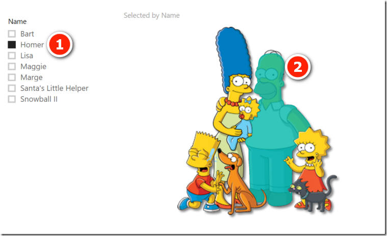
Click a Slicer and See that Person
My idea was that I would load school photos and also the reunion photos onto the one page. The user can then click on a slicer with someone’s name (or any other information about people) and “see” those people highlighted in the photo. I started thinking that I could use the excellent Synoptic Panel from The Italians for this. The only problem I could foresee was that Synoptic Panel is designed to provide shading over an image based on what was selected. I wanted to shade/hide those people that were NOT selected. Anyhow, I love a challenge.
This is What I Built

Installing Synoptic Panel
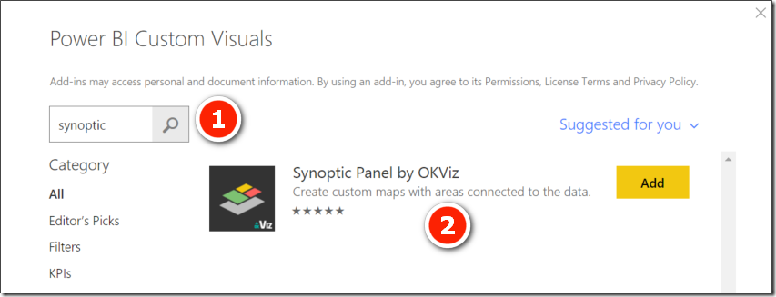
First I installed the Synoptic Panel custom visual. The Microsoft Store is now embedded in Power BI, so I used the menu items as shown below.
- I clicked on From Store (#1 below)
- Typed in ‘syn‘ (#2, short for Synoptic Panel)
- Clicked search, and got nothing (#3)
When I typed in ‘synoptic‘ and searched again, it worked this time. Mmm, a bit of work to do there Microsoft! I’m pretty sure your major search engine competition would have found Synoptic Panel for me if I searched for ‘syn‘ in a list of less than 1 hundred items.
Anyway, I installed the custom visual as shown above.
Now, how to use it?
I was a bit confused how to use Synoptic Panel at first actually. I expected to quickly and easily see a way to import a picture, but I actually had to read the documentation to find out how to do it.
In short, you need to:
- Load a table of matching data.
- Place at least 2 items into the Synoptic Panel Fields section card.
- Then and only then can you see the menu to load your image. (It would be good if the menu was visible from the start, even if it provided a warning something like “add data to fields list before importing image”.
Anyway, all good. Time to draw the selectable shapes over my image.
Create an Image
I checked out the online http://synoptic.design tool. This was pretty good, but really only helpful if you have shapes with up to 4 points. In my case I was trying to trace people, so 4 points weren’t going to be enough. Anyway, I worked out it was an SVG file with embedded vector coordinates. So I did what I always do when I need something like this done, I asked my daughter Maddie to do it for me (she is a graphic designer ![]() ). Maddie used Adobe Illustrator, loaded the image and then drew the borders. You have to name the vectors in the SVG and they have to match to the data table you are going to use. We named the vectors to be the names of the characters. Maddie is a freelancer – contact me if you want her to do some work
). Maddie used Adobe Illustrator, loaded the image and then drew the borders. You have to name the vectors in the SVG and they have to match to the data table you are going to use. We named the vectors to be the names of the characters. Maddie is a freelancer – contact me if you want her to do some work ![]() .
.
Load the Data Table
As mentioned above, you must load the data table before the image can be loaded. This is what I loaded in the data table (using Enter Data).
I named the table Simpsons and then wrote a single measure
Selected = COUNTROWS(Simpsons)
Load the Image
After adding at least 2 items to the fields list, I was able to load the image using the embedded menu shown earlier in this post.
Add a Slicer
I added a slicer and clicked on it to select one of the characters.
Select (Conceal) Items NOT Selected in the Slicer
What I wanted now was to cover those items NOT selected in the slicer, and show those that ARE selected. I wasn’t sure how to do this to start with, but a bit of trial and error (and Dr Google) I came up with the following solution.
- I duplicated the table of names and called the new table data. I needed to do this otherwise I couldn’t find a way to remove a filter coming from a slicer while using a single table (let me know if you can work out how to do that).
- I joined the tables as shown below. The Simpsons table is the Lookup Table and the Data table just has a list of names.
- I wrote the following measures:
- Selected = COUNTROWS(Data)
- Not Selected = CALCULATE(COUNTROWS(Data),(EXCEPT(ALL(Simpsons),Simpsons))).
- The EXCEPT function is the secret sauce here. It takes an unfiltered copy of the table ALL(Simpsons) and compares it to the filtered copy (the second parameter). The resulting table contains all those items in the first table that are NOT in the second table. The second table respects the initial filter context, hence the new table contains the anti-join. Of course Lineage applies here with this new virtual table, so this new virtual table contains those items NOT selected will filter the data model inside the CALCULATE.
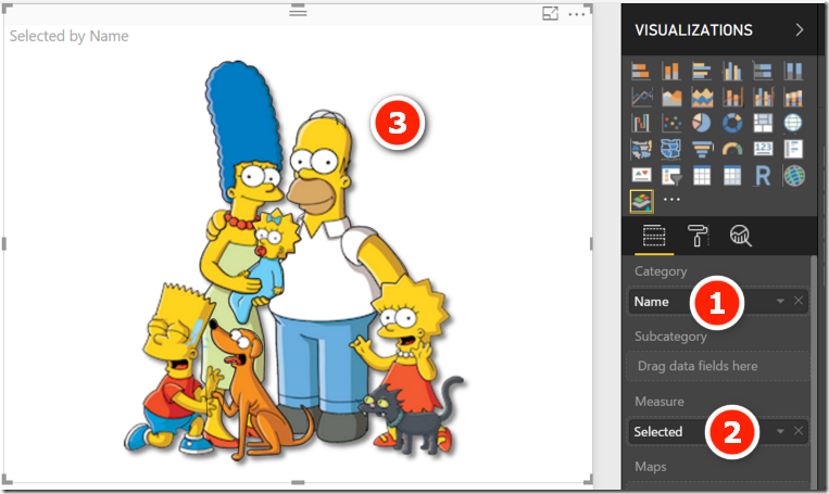
- I then changed the set up of the Synoptic Panel visual as follows:
- I put Data[Name] into Category (#1). Note, this is the data table, not the lookup table
- Placed [Not Selected] as the Measure (#2)
- The slicer is Simpsons[Name] (#3).
- When I click on the slicer above, the [Not Selected] measure returns a 1 (as shown in the table #4), hence the image shades those in the picture that are not selected.

Any Slicer Works
Of course, like any lookup table, I am able to add slicers on any column and see all the characters that match. You can play with the live interactive version below.
School Photos
As a reminder, the purpose of this idea was to load multiple school photos along with photos of us all 30+ years down the track. You can use this technique on as many images as you like. Click on a name to see a before and after, or any other meta data you have loaded.


Wow, I like to think of the not selected as being an Anti-Slicer. I wonder if this would work with two variable slicers. Will have to try it out. Thanks!
Hi Matt. this is amazing ! is there any way to do the same for tables that contain text and numbers ? Instead of the fields just showing after selecting an item on the slicer, I would like it to be shaded instead. Is that possible?
mmm, sorry. I don’t really understand what you are asking.
Hi Matt, this is very cool. Have you tried getting Synoptic Panel to sync over multiple reports like the new sync slicers functionality?
I assume you can’t sync visual cross filtering across reports, but then again I have never tried. Maybe someone can post the answer to that here.
Awesome Matt ! This is a great visualisation technique with lots of potential in business applications. Also love your yami sauce of EXCEPT function,- wondering if a construct of ALLEXCEPT can be used here too?
No. ALLEXCEPT won’t work. This is used for all columns except, not all values in a column except.
Brilliant as ever. I have a question for you though. How did you embed the Power Bi canvas? The ability to share through embedded code was removed on 18/1… so how are you doing this?
Maybe it moved. I just clicked on the Report in the Service, then selected file\publish to web
File\Publish no longer shows as an option on my menu. Curious.
Its seems if you have an Office365 Enterprise edition that you need to register the embed codes through AzureAD.
mmm, something else is up I think. I am using an EE version of PBI for a client. I can see the publish to web option when I have a report selected. Maybe try publishing a new clean report and see what happens
Sorry for being archeologist but this option can be blocked by IT Admin as is set in my corporation. All people have publish to web option turned off to prevent leak information to public and loose control over reports. Unfortunately many people have no sense of sensitivity information…