I’m really pleased and excited to introduce you to Daniil Maslyuk (Twitter: @DMaslyuk). I first met Daniil about a year ago (originally via email) as he was preparing to move to Australia. Daniil made the plunge shortly there after and migrated to Australia (from Russia) – he now works as a Power BI consultant for Agile BI here in Sydney. Daniil and I have worked together on a couple of occasions when he helped me deliver live training to a couple of larger groups that were too big for me to deliver on my own. Daniil knows an awful lot about DAX and Power BI and I am thrilled that he has agreed to share some of his knowledge here on my blog.
Over to Daniil.
Line Chart Conditional Formatting
Have you ever wished you could change the line colour depending on the overall trend? For example, if your sales increase over time, the line is green; if there is a decline, then the line is red. While this functionality is not yet natively available in Power BI Desktop, it does not mean this cannot be done! In this article, I am going to show you how to achieve this effect.
Sample data
If you want to follow along with the examples in this article, you can download the sample dataset I am using: Trend Color – Start.pbix
This is a rather simplistic dataset:

Steps to follow:
- Create a measure that you are going to track over time. In our case, I created a measure that smoothes sales:
Total Sales =
CALCULATE(
    SUM(Sale[SalesAmount]),
    DATESINPERIOD('Date'[Date], MAX('Date'[Date]), -1, MONTH)
)
Matt has described the technique of smoothing your data in his “Trending and Smoothing” article previously. I am using a different flavour of the same technique: in my formula, DATESINPERIOD returns a table of dates for a month preceding the last date in the current filter context. In other words, I am calculating SalesAmount for one rolling month (not necessarily calendar month).
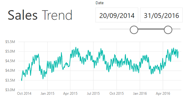
Note that in our case smoothing your data is not necessary — I am only doing this so that the graphs look less erratic 🙂At this stage, we can build the following report:
- Create a measure that calculates the slope of the line. What is slope? For our purposes, this metric tells you whether the overall trend is positive or negative. If slope is greater than zero, then the trend is positive. I’ve written a blog post on simple linear regression in DAX, and you can copy and paste the formula from there.
If you find it useful, please give it kudos in Quick Measures Gallery: Simple Linear Regression
The good news is that you don’t need to understand how this formula works to use it for your benefit 🙂
Here is the formula that I am using in our example:Slope = VAR Known = FILTER( SELECTCOLUMNS( ALLSELECTED('Date'), "Known[X]", 'Date'[Date], "Known[Y]", [Total Sales] ), AND( NOT(ISBLANK(Known[X])), NOT(ISBLANK(Known[Y])) ) ) VAR Count_Items = COUNTROWS(Known) VAR Sum_X = SUMX(Known, Known[X]) VAR Sum_X2 = SUMX(Known, Known[X] ^ 2) VAR Sum_Y = SUMX(Known, Known[Y]) VAR Sum_XY = SUMX(Known, Known[X] * Known[Y]) VAR Average_X = AVERAGEX(Known, Known[X]) VAR Average_Y = AVERAGEX(Known, Known[Y]) RETURN DIVIDE( Count_Items * Sum_XY - Sum_X * Sum_Y, Count_Items * Sum_X2 - Sum_X ^ 2 ) - Add a trend line to the graph. To do so, select the line chart, then click Analytics -> Trend Line -> Add:

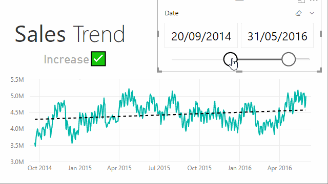
We are adding this line to confirm visually whether sales increase or decrease over time. At this point, your graph should look as follows:

- Create the Trend table. You can click Get Data -> Blank Query, then rename the query to Trend. Open Advanced Editor and replace the code there with the following:
#table(
    type table[Trend = text],
    {
        {"Increase"},
        {"Decrease"}
    }
)
I’ve created this table using the Query Editor (Power Query). As an alternative you could also use the Enter Data feature in Power BI.
- Create the Color Sales measure. For now, it should simply be
Color Sales = [Total Sales]
Stop here before proceeding. The next step is the one where all the magic happens. The key point below is that a legend in a chart provides filter context, just like a row or column in a matrix.
- Use the Trend column from the Trend table as legend in our line chart and pick the colours: green for Increase, red for Decrease. In the Values field well, replace the Total Sales measure with Color Sales.
- Replace the Color Sales measure formula. I used the following code:
Color Sales =
VAR TrendValue =
    SELECTEDVALUE('Trend'[Trend])
RETURN
    SWITCH(
        TRUE(),
        AND(TrendValue = "Decrease", [Slope] < 0 ), [Total Sales],
        AND(TrendValue = "Increase", [Slope] >= 0 ), [Total Sales]
    )
What does this measure do? At first, it may look puzzling because it returns [Total Sales] for either of the conditions in SWITCH, but if you use this measure in our line chart, you will notice that it uses only one Trend category at a time: either Increase or Decrease, depending on the value of Slope.
Why do we need to create the simple version of Color Sales first? That’s because if we create the final version right away, we will have to hunt down those periods where sales increase and also where they decrease, because with the final version, we see only one Trend category — not two. Starting with the simple version makes it easier to pick the colors. - Optional: create the Trend Card measure:
Trend Card =
IF(
    [Slope] < 0,
    "Decrease" & UNICHAR(10060),
    "Increase" & UNICHAR(9989)
)
This measure returns a green tick (✅) or a red cross (❌) when the trend is positive or negative, respectively.
Here is our final result:
Post any comments or questions you may have in the comments section below.
Download the final report: Trend Color – Finish.pbix

Thanks for sharing. I read many of your blog posts, cool, your blog is very good.
Excellent tip. I have adapted it to column chart and to kpi of sales vs sales previous year and I have explained it to the Spanish community of power bi in my blog. Thanks for your contribution Daniil
Great idea. Nicely done! Thanks!
Thanks for this, never ceases to amaze me what there is to learn!
Glad you liked it!
You showed it before, but again I’m amazed how a disconnected ‘Legend Table’ can be virtually related by a measure. Thanks for sharing!
“This measure returns a green tick () or a red cross () when the trend is positive or negative, respectively.”
It certainly doesn’t. 🙂
Re “It certainly doesn’t” — which operating system are you using? On Windows 10, you can see the tick/cross measure, as evidenced by the GIF at the end of this article.
You are right. I used Win 8.1 showing black text only. 🙁
Really cool solution. I was wondering why you chose ALLSELECTED in the slope measure?
When you use Date on axis, each point on the axis provides its own filter context (one date only in our case). Because we need to calculate the slope across all selected dates, we are using ALLSELECTED. Try using DISTINCT and you will see the difference. The Trend Card measure will provide the right results, but Color Sales will not work correctly.
Fantastic work !. Thanks for sharing
You are welcome!
Smartly conceived, solidly crafted and beautifully presented. Welcome to Oz mate!
Cheers, mate! 🙂
Nice tip, thanks for sharing. Would be perfect except for the trend direction value shows up in the tooltip. However for most of my cases this is not an issue.
Here’s a solution — you can create two measures:
Sales Increase = IF ( [Slope] >= 0, [Total Sales] )
Sales Decrease = IF ( [Slope] < 0, [Total Sales] )
Remove Trend from the Legend field well and replace [Color Sales] with [Sales Increase] and [Sales Decrease], then rename both to Sales (yes, Power BI lets you do that). To make color selection easier, you can use the same approach I took in steps 5 and 7 in this article: create dummy formulas, select colors, then write real formulas.
In tooltips, Power BI does not show measures that result in blank values. This way, you only see the new measure name (Sales) and a numeric value in tooltips 🙂
Nicely done, Daniil! I will definitely add this trick to my collection 🙂
Thanks, Maxim! 🙂