This is the third in my series where I show how I build a report from scratch. The objective is to show the warts and all process that I go through. Along the journey, I am sharing some tips and tricks. In this video, I demonstrate
- Standardising the data across states into “per million population”
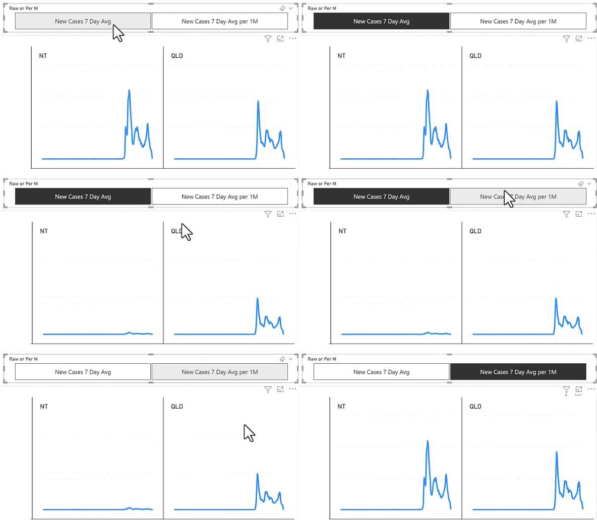
- Using a field parameter to allow toggling of a chart between absolute data and per million population.
- How I make the titles of my charts respond to the field parameter so it is clear what data is being shown.
- And of course the ‘warts’ aka mistakes I make when doing the work – this is normal.
- I demonstrate how to format all measures in the workbook using Bravo

This section explains how to standardise data per million population,
enabling fair comparisons between regions or countries with different population sizes by normalising raw figures.
This section explains how to standardise data per million population,
enabling fair comparisons between regions or countries with different population sizes by normalising raw figures.
// Standardising data per million population helps make fair comparisons across regions with different population sizes.
// It’s essential in fields like public health, economics, and demographics to ensure accurate, meaningful analysis.
Very Interesting stuff. If more organizations used Six Sigma performance metrics and incorporated those metrics into their BI reports, I’m sure they’d find value. Have you considered building/creating a chart that displays Six Sigma characteristics in defects per million? Reporting process performance from 1 to 6 sigma based on defect count per 1 million opportunities (or extrapolated if 1 million opportunities have not yet occured) would be powerful for communicating how the process is doing.
Sorry, no. I have literally 1 gazilion things I can do with my time. When I have free time I do something that is top of mind and of interest to me. The rest of the time I am working on my business.