Have you been sitting back thinking about building your own Power BI Coronavirus report, but haven’t known where to start? Many people tell me they want to get more practice using Power BI but don’t have any suitable data to do so. You can now easily build your own Covid-19 reports, and all the hard work has been done for you.
Below you will find a link to an open source Power BI PBIX download created by the Power BI specialists at coronadatasource.org. This report was sent to me by Robert Durec (who created the report and wanted to gift it to the community).
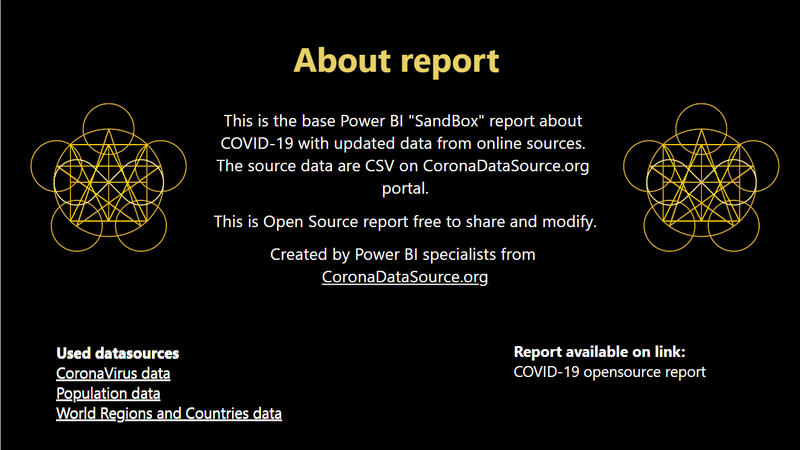
https://coronadatasource.org/open-reports/general/cds-covid-19-sandbox-open-report-for-download/
This is a PBIX file that includes all the connections to the data sources (updated hourly) and some basic measures and visualisations created. Anyone is free to download the PBIX and build out their own reports and enhancements from there. You will find some basic charts created for you, eg

But you don’t have to stop there. You can then build out the visuals you would like to see yourself and share them online or elsewhere (please acknowledge coronoadatasource.org for their work). Once you have built your report, you can publicly share it online using public sharing at powerbi.com.
Show Me and Others What You Can Do.
If you decide to download and build some new visuals, please feel free to share links to your reports in the comments section below. Show us all how you can explain what is going on around the world with your data viz skills. I may even come back to this article and embed the ones I like the most directly in this article – so go for it.
Your point of view caught my eye and was very interesting. Thanks. I have a question for you.
Hi Matt, thanks for sharing another good article. I have created my own COVID reporting to find all the answers I am daily looking for on one place. The data source is from Johns Hopkins University.
here is the link: https://app.powerbi.com/view?r=eyJrIjoiMDljYTcwNzEtMTMzNS00NzBiLWI2OWEtZWRkODNiNjBiMTU5IiwidCI6ImYyOGUxZmZkLWMxY2ItNDY4MC1iNGI4LWQ1YzRmMDQ5ZGEyZSIsImMiOjh9
Hi Matt, thank you for the article and for telling about this data source.
I have made a PBI report 3 weeks ago to simplify reading of World cases and to give an overview of my country’s situation, Algeria. The data source that I use is from Johns Hopkins University and for my country from our Ministry of health. The report is updated daily.
here is the link : https://numidiabi.wordpress.com/2020/03/27/covid-19-in-power-bi-world-and-algeria/
Looking forward to
* a good Common Data Model for Corona. The core Model shouldn’t be too difficult. +It’s a good chance to showcase the CDM-concept.
* good Heard Immunity charts … we are around 10% +
* good conceptual Value models
* ..
Thanks for that Matt, and thanks to coronoadatasource.org. I haven’t created any new Power Bi reports for some time now and they say ‘if you don’t use it you lose it’. This will help me get back up to speed. Like Peter Frederick picked up on, I think, the card and multi-row card visuals on both map tabs would be better pointing to the Basic Measures table, in my opinion, which in the interest of learning is a good thing for me. Cheers.
.
Hi Matt –
You’re spot on! Power BI does offer an excellent platform to review data being generated from the COVID-19 pandemic. Below is a link to a report showcasing features in Power BI that I’ve used to tell the story. Data is sourced from Johns Hopkins, The COVID Project, World Health Organization, and regional authorities. It contains counts, trends, and forecasts. The dashboard is updated daily and is at http://covid-19.lluh.us.
Cheers,
Ken
Great job Ken. You’ve got my vote. First time I’ve seen the world flag slicer, it’s really effective. Congratulations.
Thanks for the data but the actual provided PowerBI PBIX file needs significant work to demonstrate the real drill down features of PowerBI. I’ve been entering daily the WHO Situation Report data into my own PowerBI models since the beginning of the published statistics and publishing it for our executives. If I get a chance I’ll look at how I can improve the data connections in the coronadatasource.org model. Also not sure if you had noticed but Victoria Health and Human Services have a PowerBI Public Model available here https://app.powerbi.com/view?r=eyJrIjoiODBmMmE3NWQtZWNlNC00OWRkLTk1NjYtMjM2YTY1MjI2NzdjIiwidCI6ImMwZTA2MDFmLTBmYWMtNDQ5Yy05Yzg4LWExMDRjNGViOWYyOCJ9 .
Hi, the data for NZ is very incomplete in that central data source. The NZ Ministry of Health has more complete data, but it has other issues. I’m in the process of writing up a blog post how I created my New Zealand version of a Coronavirus Power BI dashboard. You can see the interactive report here: https://bit.ly/Covid19NZ
Thanks Ingeborg, that’s the most informative collection of data I have seen for any one country. Thanks for sharing.
Hi, Matt
Big fan of you from Japan. I don’t have any specific information about Australia or New Zealand but I’ve created a dashboard for sharing with data from GitHub and here’s the report link.
https://bit.ly/39sQUn9
I work for an US asset valuation company and this report has been added to our COVID-19 Resource Hub both for internal and external use.
Hi Eiki
Welcome from Egypt & KSA
I really liked your dashboard, I will be much appreciated to get the .pbix file.
Thanks so much