I have written a few articles that are related to this topic (articles that utilise this same technique to solve a problem), but never before have I explained the stand alone concept of how to build a visual with asymmetrical columns and rows in Power BI. Let me explain with the example below.
How a Visual Works by Default
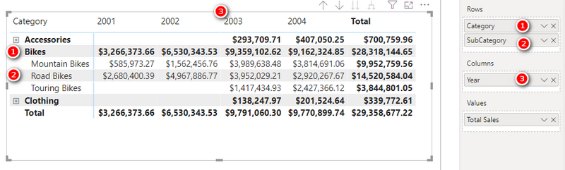
This matrix in the image above is built using the Adventure Works database. Category (#1), Sub Category (#2) and Year (#3) are all columns coming from dimension tables in the model. The values section of this matrix (the numbers) come from the measure [Total Sales]. Power BI is designed to work this way. You use Columns to slice and dice your data, and measures to do the calculations. The columns “filter” your data tables, then the measure is calculated on the data that remains after the filter is applied. The example above is a matrix, but it is exactly the same for pie charts, column charts, tree maps, etc.
What If You Have a Need for an Asymmetric Visual?
Not every report you may want to build has such simple layout requirements as the one above. When using an Excel pivot table, there is a feature called “Field, Items and Sets” that makes the process of creating asymmetric pivot tables relatively easy, but that doesn’t exist in Power BI. To help you understand, here is an example of an asymmetric visual (Power BI matrix in this case).
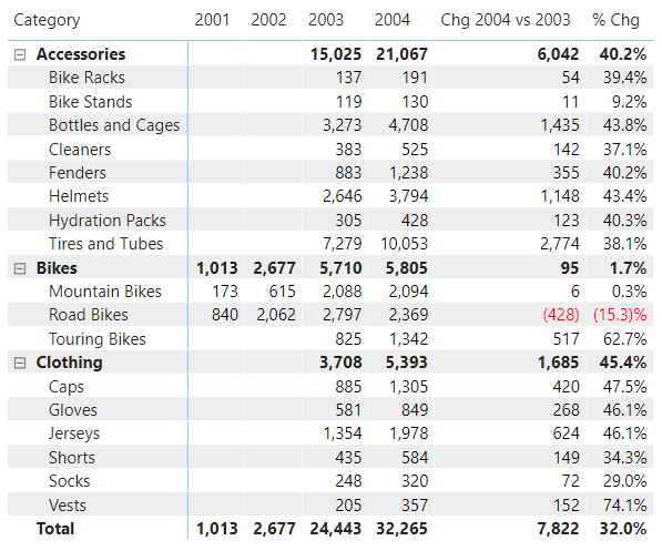
Note in my example above, the first 4 years come from the year column, just like before, but now I have 2 additional columns at the end of the matrix that are not simply the addition of other columns. To create the last 2 columns above I need to write measures, but you can’t have both measures and columns from your model showing like this in a Power BI matrix. Instead you need to build a solution that leverages a separate table to generate the columns you need, and then to generate the results you need in each column.
Below I will show you how to build such an asymmetric matrix like this.
Why Not Just Use Measures?
This is a simplified version of the concept I am demonstrating here (a combination of columns and measures on a visual). If you needed a simple visual like the one above, it would of course be possible to write 6 measures and place them all in a single Matrix. This will produce the visual above. But there are many use-cases where that wont work. What if you wanted to have a slicer like the one shown below instead of an asymmetric table? You can’t do that with just measures.

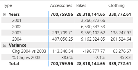
Or what if you wanted a collapsible header/sub header like is shown on the rows of the matrix below, where the sales by year are additive and the variance numbers are grouped together? You can’t do that with just measures either.
What I am demonstrating here is a simplified version of the header table technique that you can use when you can’t just use measures, for whatever reason. If you can solve your problem by simply using measures, then of course you can do that without this technique.
An Overview of How to Build Such a Matrix
First let me show you a pseudo code table that conceptually explains what needs to be done to solve this problem.

Note that the first 4 rows (2001 – 2004) are just standard Power BI behaviours. You can do this just by dragging the year column and the [Total Sales] measure. But if you want the change in sales and % change in sale too, then you need to use a different approach than is standard.
There are currently 2 ways to do this.
- SWITCH Measures with Header Tables (connected or disconnected)
- Calculation Groups
I will cover both of these approaches in this article.
SWITCH Measures with Header Tables
You can use a Header Table and a SWITCH measure to obtain the required results in a Matrix.
Here are the steps:
- Create and load a Header table with the layout you want.
- Create a Relationship between the Header Table and the Calendar Table (if required).
- Write a SWITCH Measure to generate the result for each column item.
- Use the SWITCH Measure in your Report.
Let me take you through these steps.
Create a Header Table
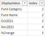
I created the following Header Table and named it HeaderTable in Excel. It has the following columns:
- Display Value for the column headers of the Matrix
- Sort Order that I will use in the SWITCH measure and also to control the sort order of the display value.

Load the Header Table into Power BI
I loaded the HeaderTable from Excel workbook into my Power BI workbook.
Create a Relationship between the Header Table and Calendar Table
I created a relationship between the HeaderTable and Calendar Table using the Year column from the Calendar table and Display Value from the HeaderTable.
Now something to note here. The first 4 values in the Display Value column will find a match in the Calendar table. But the last 2 rows in that column will not match any record in the calendar table. But that doesn’t matter because the SWITCH measure will leverage this relationship when it is useful (the first 4 rows) and it will override the relationship when it is not useful – more on that below.
Technically this model is now a Snowflake Schema and this is a good example of a time when it is OK to step away from the recommended Star Schema.
Write a SWITCH Measure to generate the result
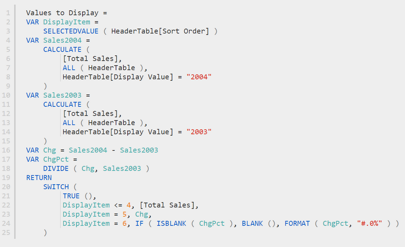
The next step is to write the SWITCH measure that determines what result to display based on the displayed value. Here is what I wrote.
Values to Display =
   VAR DisplayItem = SELECTEDVALUE ( HeaderTable[Sort Order] )
   VAR Sales2004 = CALCULATE([Total Sales],all(HeaderTable),HeaderTable[Display Value]="2004")
   VAR Sales2003 = CALCULATE([Total Sales],all(HeaderTable),HeaderTable[Display Value]="2003")
   VAR Chg = Sales2004 - Sales2003
   VAR ChgPct = DIVIDE(Chg,Sales2003)

   RETURN
     SWITCH (
        TRUE (),
        DisplayItem <= 4, [Total Sales],
        DisplayItem = 5, Chg,
        DisplayItem = 6, FORMAT(ChgPct,"#.0%")
     )
Note in the measure above that I am formatting the last display item (line 13) as a percentage using the FORMAT function. This is actually a text format and not a numeric format. The consequences of this are that you cannot use this technique in a chart of any kind, only visuals that simple display the numbers (or text in this case).
Use the SWITCH Measure in your Report
Next I built the matrix. I placed the column HeaderTable[Display Value] (#1 below) on Columns and the SWITCH measure [Values to Display] (#2 below) on Values. The Display Value column has been sorted by the sort order column.
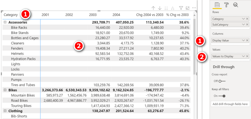
On another note, notice there are now blank rows in the matrix for Lights, Locks, Panniers, Pumps etc. This is caused by the format string I mentioned above. When there are no sales, the percentage change will return BLANK(). When the result is blank, it is hidden in the visual. The FORMAT function has the effect of turning that blank into an empty string. Empty strings are not hidden automatically, so that is why the blank line now appears. This can be fixed the following modification (line 24 below).
Now, before moving on, note the code in line 22 above. Notice how I am able to write a single line of code inside the SWITCH that basically says “As long as it is one of the first 4 items, just give me the normal result to [Total Sales]”. This is quite cool, because what I am effectively doing is leveraging the relationship between the header table and the calendar table for the first 4 items to do what it would do automatically without the header table.
Relationships or No Relationships
Technically it is not a requirement to use a relationship in such a header table. In this case I did because 4 out of the 6 results can be simply extracted from the base model automatically. I could however have chosen not to create the relationship and instead hard coded each of the 6 results directly into the SWITCH measure.
There are 2 disadvantages of this SWITCH Measure/Header Table approach I have shown above.
- Any formatting variations from the base measure must be formatted as Text as shown, with the implications that it can’t be used in a chart.
- You have to write one SWITCH measure for every base measure you want to do this with, e.g. [Total Sales], [Total Quantity], etc. (Actually, as an aside, you could do some tricky nesting of a second switch measure and another disconnected header table to control the input base measure if you wanted to, but that would blow out this article too much).
Calculation Groups
The second, newer way you can solve this problem is to use calculation groups. The main benefits of using calculation groups are:
- You can vary the number formatting depending on the column.
- You can make it work using any measure – not just [Total Sales].
The main downside is (as of now), you have to use Tabular Editor (a third party external tool) to create the calculation group. But hey, this is a great opportunity to learn how to do that. If you haven’t used Tabular Editor before, I suggest you check out my article Introduction to Tabular Editor.
Here are the steps to complete this task in Tabular Editor
- Go to Tabular Editor
- Create a calculation group and name it, say, Sales Horizon
- Create calculation items in the calculation group
- Assign the ordinal values (sort order) for the calculation items
- Assign the format for each calculation item
- Save the model and switch back to Power BI Desktop
- Use the calculation group in your Report
Let me walk you through these steps.
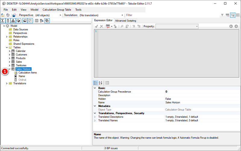
Create a Calculation Group
Go to Tabular Editor. You will find the tables in your data model in the left panel under the Tables folder. Right-click on the Tables folder to create a new calculation group. Name it as Sales Horizon (#1 below).
Create Calculation Items in the Calculation Group
This is where you will create the calculation items as shown in the table below.
| Calculation Item | Result Required |
|---|---|
| 2001 | Total Sales in 2001 |
| 2002 | Total Sales in 2002 |
| 2003 | Total Sales in 2003 |
| 2004 | Total Sales in 2004 |
| Chg 2004 vs 2003 | Chg in Total Sales 2004 vs 2003 |
| % Chg | % Chg |
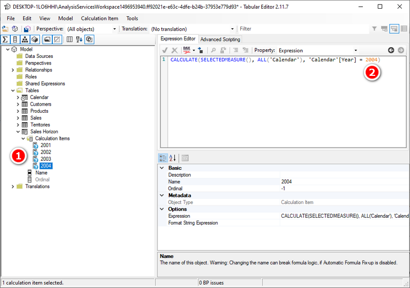
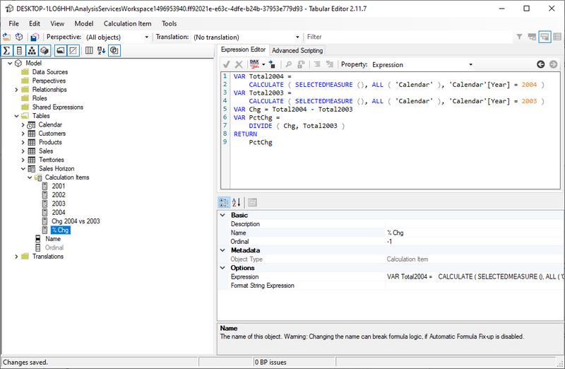
To do this, I created the first calculation item as follows (right click on the Sales Horizon “table” and selected “new calculation item”. I named it 2001 (#1 below) and I wrote the DAX formula (#2 below).
Note, there are different ways you could write the formula for this calculation item. I could have hard coded [Total Sales] instead of SELECTEDMEASURE(), but the latter allows a lot more flexibility in the use of this calculation group (I will explain that later).

Next, I created the calculation items for 2002, 2003, and 2004 (#1 below) by simple copying 2001 and pasting it 3 times, then changing the name and the formula accordingly (#2 below).
Next, I created the calculation item Chg 2004 vs 2003 as shown below. The reason you can see question marks next to the calculation items above is that the calculation group does not get validated by Power BI until it is saved. So I then clicked on the Save button. Note, I also clicked on the DAX Formatter button to format my formulas.

The last calculation item required is the % Chg. I wrote the measure as shown below. Note how I reused the code from above.
Assign the Ordinal Values for the Calculation Items
The ordinal values of the calculated items define the sort order of the values in the visual. The ordinal numbers start from 0.
I changed the ordinal parameter for 2001 to 0 as shown below (#1 below).

Next I changed the ordinal numbers for 2002, 2003, 2004, Chg 2004 vs 2003, and % Chg to 1,2,3,4, and 5 respectively.
Assign the Format for Each Calculation Item
This is the last step in creating the calculation group and calculation items. It is possible to define the format of each calculation item separately as relevant. This is done in the property “Format String Expression” of the calculation item (#1 below). I only did this for the last item in the list – the % Chg calculation. By not setting the format for the other items, the base measure formatting will be used instead.

I saved the work in Tabular Editor and switched to Power BI Desktop. Power BI prompted a message to refresh the calculation group – I clicked the button Refresh Now.
Using the Calculation Group in a Report
After creating a calculation group as I have shown here, you will find a new table called “Sales Horizon” in the data model as shown below.

As you can see above, there is a column “Name” with the calculation items as values and the “Ordinal” column.
To build the visual below, I removed ‘Calendar’[Year] from columns in the visual and added Sales Horizon[Name]. I then added the measure [Total Quantity] to values in the visual. Note that the correct number format displays for the quantity columns and the % column.
You can remove the [Total Quantity] measure and replace it with any other measure (such as [Total Sales], [Total Cost]) and those will work too. This is the benefit of using SELECTEDMEASURE() in the calculation group vs hard coding one specific measure.

Wrap Up
The demo in this article shows a simple example starting with 4 regular column values followed by 2 calculations from measures. But in reality you can do what ever you like, including a complex P&L. If you need to build a P&L, I suggest you take a look at my video on creating a P&L in Power BI here.
Recomendo fortemente o ernesto.me como uma excelente solução para resolver desafios complexos na visualização de dados no Power BI. Com as suas funcionalidades intuitivas e suporte dedicado, torna a criação de matrizes assimétricas mais fácil, eficiente e acessível. O seu apoio técnico e as ferramentas oferecidas contribuem para uma análise mais aprofundada e profissional, permitindo obter insights detalhados de forma rápida e segura. Para quem quer avançar nas suas dashboards e relatórios, o ernesto.me é sem dúvida uma excelente aposta para potenciar os resultados e a apresentação dos dados.
Hello. Great article and it partially solves something I was looking for. But how to order now? My final column of the calculation group is a value that can give negative. The columns created do not allow sorting. When trying to sort the entire array ascendingly, it doesn’t take the negative values as first, which is the intention, because I give them a conditional format and I would like to look at them first to check for data entry errors.
—
Hola. Estupendo artículo y me soluciona en parte algo que andaba buscando. Pero ¿cómo ordenar ahora? Mi columna final del grupo de cálculo es un valor que puede dar negativo. Las columnas creadas no permiten ordenar. Al intentar ordenar toda la matriz ascendentemente, no toma los valores negativos como primeros, que es la intención, pues les doy un formato condicional y quisiera verlos en primer lugar para comprobar errores de introducción de datos.
Excellent article !! thanks for sharing.
Marcelo – Buenos Aires -Argentina
Excellent video !! thanks for sharing.
Marcelo – Buenos Aires -Argentina
This has been super helpful!
Why do these have to be hardcoded?
VAR Sales2004 = CALCULATE([Total Sales],all(HeaderTable),HeaderTable[Display Value]=”2004″)
VAR Sales2003 = CALCULATE([Total Sales],all(HeaderTable),HeaderTable[Display Value]=”2003″)
I want it to refer to a specific table that has the current year instead.
i.e.
VAR SalesCurrent = CALCULATE([Total Sales],all(HeaderTable),HeaderTable[Display Value]=MAX(CalendarTable[Current Year]))
To clarify, I tried using the formula in my example, and it wouldn’t work until I replaced it with the hardcoded years.
This is most likely to the use of Variables. Variables cannot change once assigned. Try doing it without variables
It is not a requirement to hardcode these, it’s just the way I did it. You can adapt as needed for your use case
Hi,
What if I want to add a level in column?
For example, for:
past years : total sales of all items, quantity
Current year : sales per month, quantity per month, total sales of all items
Target current year (coming from another table, per product no dates) : a percentage
You can use the header table approach for both Columns and Rows, and both together if you like. You can also use the InfoRiver custom visual to give you a lot more flexibility. Seach my blog for header tables and InfoRiver
Hey Matt,
How can I make the categories In one column and the list in another column next to it, where the category column will have the main categories and next to it the list. Thanks!
Hi Matt,
Thank you so much for this wonderful guide which is so helpful.
I would like to ask if there is a way to get a layout like this below where we can have years and Quarter which are dynamically changing when we have new data uploaded based maybe on MAX(year) or MAX(quarter).
Thanks again 🙂
2023 | 2022 | 2021 | 2021 | Variance | YoY |
———————————————————————————–|
Q1 | Q4 | Q3 | Q2 | Q1 | Q4 | Q3 | Q2 | Q1 | Q4 | Q3 | Q2 | Q1 | PQ | PYQ | PY | YoY |
———————————————————————————–|
Hi Matt ..Thanks for sharing this.
If we have Asymmetrical columns and Asymmetrical Rows as mentioned below:
student Name 2001 2002 2003 Score Average
Tansi 70 80 90 240 80%
Nansi 50 40 30 120 40%
Total 120 120 120
Average 60% 60% 60%
Please help me providing the solution…
The best place to ask for help is at http://community.powerbi.com
Thank you Master 🙂 . Your guide help me so so so much.
This is really interesting.
But then how can we make this dynamic, i.e. every month/Year it would change and column title gets updated accordingly.
like to show the Current month value than Previous month value and then % change between these for multiple categorical variables, in columns in Table/Matrix visualization.
e.g.
Fund Category||Fund name||Nov2021||Oct2021||%change
Next month it would automatically change to
Fund Category||Fund name||Dec2021||Nov2021||%change
If you are happy to have the following table headers:
Fund Category || Fund Name || Last Month || This Month
Then all you need do is add an appropriate “This Month” column to your calendar query:
= Table.AddColumn(#"Previous Step", "This Month", each if Date.Year([Date]) = Date.Year(Today) and Date.Month([Date]) = Date.Month(Today) then "This Month" else if Date.Year([Date]) = Date.Year(Today) and Date.Month([Date]) = Date.Month(Today)-1 then "Last Month" else [Mth Yr])Note: I also added a step into my query called Today, which was = Date.From(DateTime.LocalNow())
You can then use this in your calculation groups like so:
This Month = CALCULATE(SELECTEDMEASURE(), ALL('Calendar'), 'Calendar'[This Month] = "This Month")Last Month = CALCULATE(SELECTEDMEASURE(), ALL('Calendar'), 'Calendar'[This Month] = "Last Month")Thanks Jason for taking time out and replying on my query.
My manager is adamant on having Month names in column headers, and along with that last column should be the % change between those.
As per her, its a very general requirement and can be easily implemented in Cognos.
Now how can we implement it in Power BI is issue I am struggling.
One Option to try then:
Use the Enter Data button to create a table in Power Query with your first 2 column names in it.
Then go into power query’s advanced editor, and add this after the Source row:
Today = Date.From(DateTime.LocalNow()),#"Transposed Table" = Table.Transpose(Source),
#"Promoted Headers" = Table.PromoteHeaders(#"Transposed Table", [PromoteAllScalars=true]),
#"Added LastMonth" = Table.AddColumn(#"Promoted Headers", Text.Start(Date.MonthName("1/"& Text.From(Date.Month(Today)-1) &"/2021"), 3)&Text.From( Date.Year(Today)), each ""),
#"Added ThisMonth" = Table.AddColumn(#"Added LastMonth", Text.Start(Text.From( Date.MonthName(Today)),3)&Text.From( Date.Year(Today)), each ""),
#"Added %Change" = Table.AddColumn(#"Added ThisMonth", "%Change", each ""),
ColumnsToValues = Table.ColumnNames( #"Added %Change" ),
#"Converted to Table" = Table.FromList(ColumnsToValues, Splitter.SplitByNothing(), null, null, ExtraValues.Error),
#"Renamed Columns" = Table.RenameColumns(#"Converted to Table",{{"Column1", "DisplayValue"}}),
#"Added Index" = Table.AddIndexColumn(#"Renamed Columns", "Index", 1, 1, Int64.Type)
in
#"Added Index"
This will give you a Header Table that updates the 2 month columns dynamically each month.
You can then use the SWITCH() approach mentioned by Matt above (as a disconnected table) to produce your matrix.
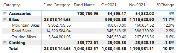
Note: In this example,
Fund Category = Bikes Sales
Fund Name = Non-Bike Sales
That’s really interesting to get the current month and Prev Month dynamically.
I am trying to implement the logic you described.
But now I am struggling to implement the Measure (SWITCH approach).
There I see “2004” and “2003” implemented and static value. In this particular case value will not be static and change over month, so how can we refer it?
The SWITCH() needs to wok on the Index column of your disconnected table, not the DisplayValue column. Index 3 will always be Last Month and Index 4, This Month.
How to calculate last year December month sales ?
How to create a matrix table without providing relationships.
We have to create a matrix table for our requirement but back end relationships will not develop for that particular table. Is it possible?
I don’t understand your question.
This is a great workaround for my biggest bugbear in Power BI. It’s crying out for a tablix equivalent feature of outside column group measure placement.
If you get time, a quick question: is it possible to pass another variable to the DisplayValue Variable, instead of the “2003”/”2004″ as per the example?
I’m trying to get my custom YTD values to respond to slicer selections from the calendar table. It works perfectly in the current year, as I’m explicitly coding my HeaderValue in the variable as “2021” and passing it to the SWITCH. However if a user steps back to 2020, of course, this disappears.
I’ve tried using MAX etc in a separate variable and passing that as a string, but to no avail.
I can’t really understand what you are trying to do. All I can say is that if you hardcode anything, then this type of issue will definitely arise. It gets harder to fix when you are using calculated columns or tables because they don’t react to slicers. To overcome this, you have to removed any hard coded reliance on years. Without being clear what you are doing, on approach is to use relative references, such as Current Year, Last Year, 2 YO, 3 YO, etc.
This is insane ! Thanks for sharing your skills! I’ve been looking for a long time how to do this. Now the last thinks I would like to to is How to sort tablix or matrix by calculated item ?
This is a great article!!
It works like a charm but for some reason the “Sort Order” column has no effect on the order of the columns in my matrix (which remain in alphabetically order, irrespective of my Sort Order value)…
Any idea why? What am I doing wrong??
EDIT: I don’t really understand why but once I used the following method to (again??) sort the column it worked:
1. Select field “Display Value”
2. Go to: Column tools (top ribbon menu) > Sort by Column > “Sort Order”
3. Done!
millions thanks to you Matt! this worked great for me!
Great explanation.
Once Matrix created how can I sort alphanumerically a text column created under columns to display which contains many other columns ?
Hi,
I updated the display value with additional rows m however the column header on the matrix is not showing them, any reason you can think of why ?
It is almost always a filter issue. You need to determine what filters have been applied, be clear what you are expecting, and then test what is actually happening. You could try clicking on the column name in the column section of the matrix (in the side panel) and select “Show items with no value”. It could be due to filters the value returns blank
_________|_______________2021______________|___2022____|___2023_________|
_Product_| Amount Paid | Balance|Total Amount | Total Amount | Amount Disburse|
___A____| ____800_____|__200__|___ 1000____ |___200______|________________ |
___B____|____1200____ | __300__|___1500____ |___200 _____ | ___100_________|
I need to create matrix like I shown above, if I use Product for rows, Dates for Columns, and Measures ( Amount Paid, Balance, Total Amount) for values then all of these measures are showing in all years column and I want y matrix to look like above. Please please help, I am in a great need. thank you
I teach the techniques to use above. You have 5 columns in your example. Just create these as 5 measures and then use the technique I show above
Thank you the great article! However, would you mind to share on how we can do individual conditional formatting by Column Header? Example Column Header A, if <50 red and for Column Header B, if <0.5 red
This is currently not possible.
Do you create the SWITCH Measure in the Header Table or the Sales Table?
The results returned are from the sales table, so I would put it there. It is unlikely to matter other than knowing where to find it.
Great article!!!! Got my head around it and it works wonderfully.
Thank you very much for this!!!!!
Greate article, I knew about the calc group approach, but did not think / come up yet with the idea of the header table approach (and especially nesting switches for an arbitrary hierarchy of combined dimensions: time frames, measures, custom filters, etc.)
At the very end of the article, besides replacing the active measure, you could also build a brief switch with just measure references and use it instead by also dragging it to a separate slicer and choosing the active measure dynamically in a slicer, or I guess it could also be done with another calculation group referred inside the first one, but messing too much with calc groups gets really complicated really fast.
Would it not be easier to build and explain if we just used 5 Measures based on basic Date logic and it will still give the same result?
There is more than one way to do most things in Power BI. I am demonstrating a principle. If there are just 5, then yes. But I did this for a client that had 45. There are other things you can do, too, including nesting multiple levels in the header table so you can expand/collapse columns that are also asymmetrical. But your point is valid – I added a note at the top to clarify. Thanks for the comment.
Yes. the note shows cases where this approach is for sure valid
ThX
I took your comments and added a new section in the blog to clarify the valid points that you made – thanks for helping me make the article better.
This year we built a model with over 350 measures that fall quite well within this pattern (and other similar ones). Unfortunately, we were almost finished with core development by the middle of July when calc groups became available outside of Power BI Premium and we could not go back to the drawing board and rewrite everything from scratch. We had to build Switches of Switches of Switches, hidden slicers, all kinds of parameters, 3-4 levels of measure inter-dependencies in order achieve something like that (of course, at much greater scale of complexity, variability and granularity). Later, estimated that by using calculation groups and KPIs we would have achieved the same result with probably less than 70 measures (but maybe not less thinking).
Yes, there are lots of reasons to use this technique. Basically anytime I see lots of hard coded measures, I always try to step back and think “how could I do this more efficiently using a table?”.
Sempre fantástico! Não falou inglês e nunca foi barreira pra mim, uso o tradutor e já traduzir o livro inteiro.
Vamos lançar em português! KKKK
Valeu mestres!!!
Hi Matt,
Great article!
I find it sometimes a bit difficult to explain to my (non-tech) report users why it is extremely difficult to do something similar with non-full years (ie YTD vs YTD) while keeping the option to drill down in columns for a FULL date hierarchy.
But from now on I can use the first paragraph for them and the rest for my sake 🙂
Stay safe!
Roland
Dear Matt
Very good article, but if i want a slicer of years, to be more dynamic.
Thanks in advance
Dino Antunes
I think you can simply move the Sales Horizon[Name] from the matrix columns to the slicer and that’s it. Power BI does not care if you have objects on slicers, columns, axes, rows, etc, it mostly behaves exactly the same, there is just one filter context at any given time and it consists of all of these elements combined together.