History of Switch Measures in Power BI
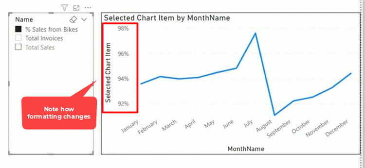
Using a switch measure to toggle results is a mature and common technique used in Power BI and Power Pivot for Excel. For example, a switch measure can be used to toggle what appears on a chart so that the end user can easily switch the data being visualised (see image below).

This technique uses a disconnected table, a slicer to receive the user selection, and a switch measure to change the result of the measure based on user input. When you select an option on the slicer you can have your chart update to show the result you want to see in the chart. I blogged about this in 2014 here. This is what the switch measure from above looks like.

While this technique is useful, there has been a limitation with this approach; the final measure can only have a single number format.
e.g. if you have the following 3 measures that require different formatting, your chart can display the values as per the selection, but the axis format will not change in response to the different measure.
- Total Sales – Currency
- Total number of Products – Whole number
- Chg vs LY % – Percentage

I created an idea in Power BI ideas site in 2016 to allow formatting based on a selection in the Switch measure. The idea received more than 3,000 votes. It is now possible to solve this problem using Calculation Groups instead of switch measures. In my blog article today, I am going to show you how to do that.
Limitations of Calculation Groups
Before starting, there are some limitations you may want to consider. They are all listed in the official documentation, right down the bottom of the page. Noteably, calculation groups will stop implicit measures working. You will no longer be able to drag a random column to a visual and aggregate the number. Instead you will have to write measures for everything (just like Analyze in Excel). It is good practice to do this anyway, and you can use Tabular Editor to script that process too.
Measures in the Data Model
I am using Adventure Works database again for this article. And as shown below (#1) I have 4 measures with 3 different formats (I will use just 3 of these in my demo below).

Set up the Report
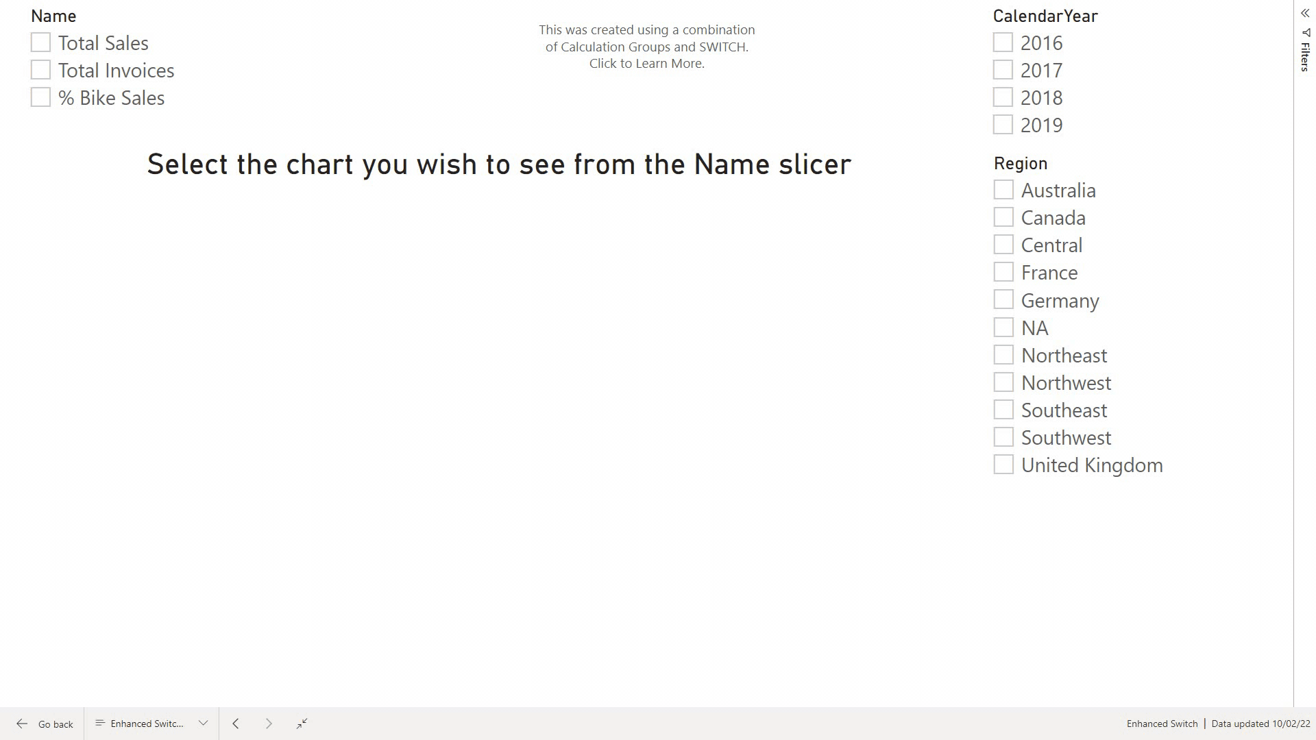
First, I placed a chart and a slicer on the report canvas as shown below.

Using the old switch measure technique, the next step would be to create a disconnected table for the slicer. The new process will use a Calculation Group instead of the disconnected table. To do this, you must have Tabular Editor installed on your computer. You can read more about doing that in my article about installing external tools for Power BI.
Tabular Editor
Under External Tools (#1 below) select Tabular Editor (#2). If you do not see these menu options in Power BI Desktop, read my article linked above.

Tabular Editor opens and you can see the tables in your data model under Tables in the left panel.
Create a Calculation Group
Right-click on Tables folder (#1 below), click on Create New (#2) and then on Calculation Group (#3).

I named the New Calculation Group as Chart Item (#1 below).

In the Calculation Group Chart Item (#1 below), create Calculation Items. Right-click on Calculation Items (#2) and then click on New Calculation Item (#3).

I created 3 Calculation Items as shown below (#1).

The next step is to create a measure for the calculation group. This used to be managed by the switch measure using the old technique:
- Right-click on the Calculation Group “Chart Item” and then click on Create New and then on Measure.
- Name the measure as Selected Chart Item (#1 below)
- Add the special DAX function SELECTEDMEASURE() for the measure Selected Chart Item as shown below (#2).

Next for each of the Calculated Items (#1 below), add the corresponding measure (#2) as expression (#3). There is no IntelliSense at the time of this writing and you should be careful to write the measures exactly as they appear in the data model. Next, click on Save (#4).

Let’s pause here and go and take a look at how it works.
You will see a new table called “Chart Item” containing a single column and a single measure in Power BI (#1 below). If you have ever used switch measures in this way, you will recognise this new table, column and measure deliver the same experience you would be used to.
I added the ‘Chart Item'[Name] column to the slicer (#2 below) and the [Selected Chart Item] measure to the line chart (#3 below). Next I added the Calendar[MonthName] to Axis of the chart x axis and set a filter on Fin. Year = 2004.

Notice that at this stage, the format of the % Sales from bikes is decimal formatting (#4 above). This is the original issue I referred to above, and this issue can now be solved with Calculation Groups.
- Switch back to Tabular Editor.
-
Next, navigate to the original Total Sales measure (#1 below), find “Format String” (#2 below) and copy the format (#3 below). Then navigate to the Calculation Item (#4 below), find the property “Format String Expression” (#5 below) and paste the Format String Expression (#6 below). [Note: you can type the string without cut and paste if you know the correct syntax to do so – I just think it is easier to cut and paste.]

- Repeat for the other 2 calculation items.
- Save the changes and close Tabular Editor.
One thing to note here. The format string Expression (#6 above) must be enclosed in quotes, but it is not in quotes shown in #3 above – confusing, I know. The reason for the difference is that #3 above is a property of the measure. The format expression string #6 is actually a DAX formula that must return a text string. This is actually very powerful because you can specify a static string like “#,##0”, but you could also write a DAX measure that conditionally returns different text strings, like IF([Some Measure] = “some condition”,”format type 1″,”format type 2″). I hope that makes sense. You can read Kasper’s blog article here if you would like some more information
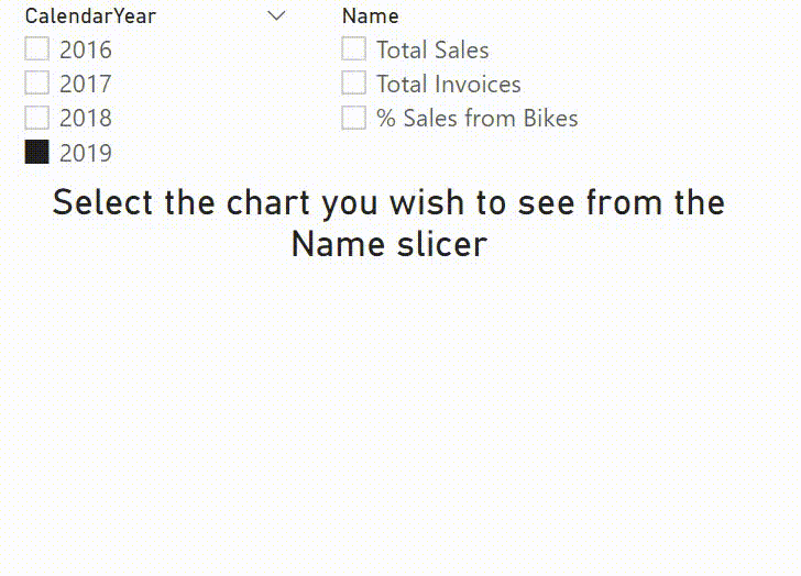
Using the Calculation Group to Dynamically Filter the Chart
As shown below, note the chart axis now updates to reflect the correct number format.
Can you be more specific about the content of your article? After reading it, I still have some doubts. Hope you can help me.
This is fantastic!
My question is – how can I make it work to affect more than one visual? I have 3 Line Charts on my page – one that shows Incurred, one that shows Paid, one that show Premium.
The Incurred and Paid charts need to toggle between Amount and Ratio. This method would require me to have 2 slicers, one for each chart. How can I use one slicer showing Amount and Ratio as the options, which then would impact both line charts?
Thank you!
This is amazing! Thanks for sharing.
I have an extended question – as your above example, X value is Month, if I have additional dimension like Region, and would like the chart to be switched between Month and Region, as well as between those three measures, I’m wondering how to make the units properly formatted?
I tried myself, but because the SelectedMeasure is the Total Sales, it made each month and each region the same value.
I wonder if there is a way to fix it and make dynamic formatting of switch both dimension and measure work. Thanks.
Hi Winnie,
Great Question. If I understand correctly, you want to switch between the 3 measures, but also have an additional slicer that lets you slice each measure by Region.
If so, I am actually writing a new blog on this at present, but if you check out my reply to Lana in the comment directly under yours, you will see how that can be achieved.
Thanks Jason, the instructions are amazing. I figured it out!
Replying to myself – also wondering in addition to the dynamic switch between measures and dimension slicers, if there is way to dynamically change the chart type, i.e. when select Total Sales visual is bar chart, when select % Sales visual is line chart…
In addition, I found an issue after doing all these – back to Power BI desktop, looks like any other measure that was not formatted by tabular editor, can not be formatted anymore using the Power BI interface.
Hi Winnie,
You should be able to still update the formatting on other measures.
What you might be seeing is that the values don’t show the implemented changes due to Power BI Caching.
To Test, once you have made a change to the formatting, set up a new visual with your changed measure, slicing the measure up by a different field.
This should force Power BI to send a new query to the Power BI database, and hence will load the info into the visual with the updated formatting.
Hi Jason – I can’t reply to your msg so have to reply to myself, this is the issue I experienced: https://github.com/TabularEditor/TabularEditor/issues/544. Looks like it’s for now an issue with TE or Power BI.
Hi Winnie,
Okay yes. That is a design feature of Tabular Editor, to encourage developers to follow best practice and ensure you are explicitly writing DAX measures rather than dragging and dropping columns.
Hi Jason,
I have one more questions regarding this topic:
I’ve created Month, Region and some other dimensions and the switch works fine. But my month is not sorted properly.
Actually I created a Dim Table using DAX Union and Crossjoin functions, to retrieve the values from my data:
Dim_Table = UNION(
CROSSJOIN(ROW(“Dim”,”Region”),VALUES(PLF[Region])),
CROSSJOIN(ROW(“Dim”,”Route”),VALUES(PLF[ROUTE_NAME])),
CROSSJOIN(ROW(“Dim”, “Mth”),VALUES(PLF[MONTH])))
My PLF[MONTH] data is 2,3,….10,11,12. When switch to Mth dimension, the chart is sorted by 10,11,12,2,3,…..
Do you have any suggestions on how to fix this? I try to minimize the manual entering data & try not to change my original PLF[MONTH] data.
Thank you.
Hi Jason, can’t wait to see your Calculation Group blog post. I’m currently stuck on a problem trying to display multiple lines simultaneously on a Line and Column chart using calculation groups and hoping your post will offer some insight.
Hi Matt, this is a neat trick. I normally have a dummy Values = 1 measure which I put into graphs like that.
It says “values” but in your case Selected Chart Item is not much more informative.
What attracted me to read the post in the first place, is how your title chart on the top of the page was changing to reflect the selected measure name.
With calc groups, you fixed the formatting issue, but you lost the wonderful display of the proper measure name in the chart title.
I wonder if you know how to get that with calc groups?
Thank you for the great work!
Replying to myself. I suddenly understood why the selectedmeasurename() returns a number in the calc group context. It’s so simple. Calc Group selection overrides all measures in the visuals it affects, so the selectedmeasurename – when a Total Sales is selected – becomes Total Sales. I just tried to use a Switch on the calc group table and got the same result. Isn’t there really a solution?
There’s a function called SELECTEDMEASURENAME that is suspect could solve the problem.
https://docs.microsoft.com/en-us/dax/selectedmeasurename-function-dax
I haven’t used it and I could be wrong.
Hi Lana,
Yes. It is possible.
The key is in how you set up the calculation group.
In the example above, Matt has coded the Calculation Group with the following Calculation Items:
Total Sales = [Total Sales]
Total Invoices = [Total Invoices]
% Sales from Bikes = [% Sales from Bikes]
However, if we set the calculation group up with [Selected Chart Item] as a SWITCH() we can still leverage Expression Based Formatting for the title.
The Calculation Items then:
Total Sales = SELECTEDMEASURE()Total Invoices = SELECTEDMEASURE()
% Sales from Bikes = SELECTEDMEASURE()
Next we need our SWITCH() to define which measure we want:
Selected Chart Item =SWITCH(SELECTEDVALUE('Chart Item'[Ordinal]),
0, [Total Sales],
1, [Total Invoices],
2, [Customers with no Purchase]
)
Lastly, we want our [Title to Display]:
Title to Display = SELECTEDVALUE('Chart Item'[Name]) & " by Month"If you want to take your title to the next level:
Title to Display Improved =IF(
ISFILTERED('Chart Item'[Name]),
SELECTEDVALUE('Chart Item'[Name]) & " for " & SELECTEDVALUE('Calendar'[CalendarYear], "Multiple Years"),
"Select the chart you wish to see from the description slicer"
)
This will ensure that if there is no Calculation Item selected, we get a message in the chart explaining what to do.
Note: I have also turned the Y Axis Title off, to get a nice clean chart.
Thank you!
I am looking for Dynamic chart titles with calculation groups and your post really helped!
Simply Amazing…
Hi! I’m very interested in using this instead of the switches. Which licence of tabular allows me to do this? thanks in advance for the reply. regards, Arina
This works with the free version
I am trying to get the Name column in a calculation group to add inside a card…tried with selectedvalue for this columns and returns the value numeric not the text column value.
I am using Cgroups to select measure and want to create a card with the name of Selected metric.
did you find any solution to this, I’m too looking to implement the same, SELECTEDVALUE() and SELECTEDMEASURENAME() both did not work for me.
Hi Mat. I was trying to use your solution but I’m not sure how maybe you can help me.
I want to give the option to see the data in Euros or Kg (this would be the slicer).
I have four measures:
1- Pruduced with Child Labour in EUR
2- Produced with Child Labour in KG
3- Produced Without Child Labour EUR
4- Produced Without Child Labour KG
In the slicer I want to have only EUR and KG, how can I use Calculation Groups?. Right now I have the following two Switch Formula
Formula #1:
With Child Labour =
SWITCH(TRUE(),
VALUES(‘EUR/KG'[Measure]) = “€”, [Pruduced with Child Labour in EUR],
VALUES(‘EUR/KG'[Measure]) = “KG”, [Produced with Child Labour in KG],
BLANK())
Formula #2:
Without Child Labour =
SWITCH(TRUE(),
VALUES(‘EUR/KG'[Measure]) = “€”, [Produced Without Child Labour EUR],
VALUES(‘EUR/KG'[Measure]) = “KG”, [Produced Without Child Labour KG],
BLANK())
Thank you very much
Regards,
Eli.
My post shows 2 concepts. One is using SELECTEDMEASURE(). Using this approach, you can use calculation groups for multiple measures. The second hard codes the measures and effectively uses calculation groups as a substitute for a switch measure. My best guess is you need to combine these 2 concepts. Create 2 calculation items (KG and Euro) with their own formatting and use the SELECTEDMEASURE() as the measure. Then change your measures above can be added to the visual.
Matt,
Your post was very helpful but I am attempting to dynamically change the title on the chart. I have attempted several ways to determine which measure or calculated item was selected on the slicer. Selectedvalue, selectedmeasure, isselectedmeasure, etc but none of these seem to allow me to get to the active measure or calculated item. I see on the graph above the title on your chart is Selected Chart Item by MonthName. My process displays a similar title which is not what I want.
Thanks for your time.
I’m not clear what the issue is. If you want to determine what is selected in a slicer, then use SELECTEDVALUE() on the column used in the slicer. Write a test measure and stick it in a card so you can see what it does. Get that right first, then place it in the title as a conditional function.
Hi Matt. I am having the same issue. I’ve followed your examples above and am trying to use this formula to produce a title for my charts:
Name Text = SELECTEDVALUE(‘Metrics Group'[Name]).
I get a card showing the sum of the measure I’ve selected in the slicer. I also cannot use this measure as the chart title.
The switch method successfully reflects chart measures in the title, but formatting is incorrect. I need formatting and chart tiles. Any ideas?
Sorry, it is very hard to understand the issue. I normally don’t provide support via my blog, but if you can post a link to a workbook clearly showing the problem, I will take a look for you. Of course, don’t post any sensitive information – so you may need to build a sample demo workbook to show the problem.
Hi Matt,
I followed your steps and I encountered a problem. Once I deploy the changes from the tabular editor, the slicer and visual work fine, however, all my fields lose their format functions (to be precise the format is displayed correctly – e.g. whole number). Now these fields cannot be dragged anymore to the values field of any visual. All these fields also lose their little sum sign next to them in the right panel. Only measures now can be dragged as the values in the visuals.
I tried twice, but every time I deploy from the tabular editor, this happens.
Yes, this is correct. Once you use calculation groups, implicit measures are not supported. This is the same with Pivot Tables in Analyze in Excel. https://community.powerbi.com/t5/Desktop/Tabular-Editor-Calculation-groups/td-p/1283596
Thanks for a great article, taught me a lot.
Any idea what the correct Format String Expression to format a number such as 123456 as 123K inside the quotation marks might be?
Using the string “#,” returns 123
But if I use “#,K” then it returns 123456K
And attempting to put K inside quotes “#,”K”” doesn’t work at all
Yeah, I don’t know how to do that. I would simply divide the measure by 1000 and then add the K in the format.
Thank you so much Matt. You helped me solve a problem that truly stumped me. This blog post is awesome. I have learned a lot through your other articles.
Many thanks!
Hi Matt,
Thanks for the instructions, have been using this on a model im working at.
One unfortunate result though is that date-measures and time intelligence in general is completely out of order when tabular editor for conditonal formatting.
After setting up the tabular editor the TODAY() formula returns “General Da e” insted of todays date. “General Date” is the title of the standard out of the box formatting of TODAY(). If i change the formatting to i.e. (mmmm yyyy) it returns 0000 2020.
Are you (or anyone else reading this) experiencing the same issue around dates when using tabualr editor for conditional formatting?
strange. I wonder if there is some locale language issue. I suggest you log a question with Daniel at the TE website
Hi Matt,
First of all, thank you very much for this concept and it has helped me immensely. I see that your chart has only one line item ie. Sales that then dynamically changes as per the different format in the Chart Name. How do I go about this if I wanted a second line in the lin chart , let’s say Target Sales line? How do I dynamic measure formatiing for two or more lines in the chart ?
Thank You
I guess just do it all again with a second measure and add it to a dual axis chart or a combo chart
Great step by step. I got this to work as far as the formatting, but I’m using it on a combo bar/line chart with the line on a secondary y-axis. I only want the slicer to apply to the line but it also changes the bar to the selected measure, even though I have a static measure dragged over to the bar series. Previously, just using the switch method, this wasn’t happening. Any idea what might be causing this?
thanks
Assuming you have a different measure for the bar chart that is not related to the slicer, then no, I have no idea what can be happening. If I were testing this, I would switch it to a matrix to see what is happening to the numbers.
This is Awesome, thank you so much!
Matt, How did you create those GIFs at the beginning and the end?
I use FastStone Capture to record a short video, edit the video in FastStone and then save as gif.
Hi Matt,
Thanks for a very clear instruction. Very helpful. I have been using switch for a while, and the formatting problem has bothered me.
Now I have a slightly more complex setup with several measures depending on one selection and I am not sure if it is possible to do this using calculation groups. I would be grateful if you could point me in the right direction!
I have two graphs on one page: one showing selected_measure_median and the other showing selected_measure_q90
I need to somehow set both of these properties with one selection.. preferably using calculation groups and I can’t seem to figure it out
This is my current setup using switch (that I want to get rid of)
Metric Selected Index = SELECTEDVALUE(‘Metric Selection'[Metric index],BLANK())
Selected Median Metric =
SWITCH( TRUE(),
[Metric Selected Index] = 1, [sig_1 median],
[Metric Selected Index] = 2, [sig_2 median],
[Metric Selected Index] = 3, [sig_3 median], BLANK())
————————-
Selected Q90 Metric =
SWITCH( TRUE(),
[Metric Selected Index] = 1, [sig_1 q90],
[Metric Selected Index] = 2, [sig_2 q90],
[Metric Selected Index] = 3, [sig_3 q90], BLANK())
Your measures look like they don’t need to swap formatting. If that is the case, why are you wanting to do this with calc groups?
Ah. Sorry. sig_1 and sig_2 needs to be displayed with 2 decimal positions (values typically doubles like 0.21, 1.56, etc). sig_3 is an integer that I want to show without any decimals (typical values 345, 123, 45)
The actual problem is that I show them not in a graph but in a matrix with many columns and sig_3 shows like 345.00, 123.00 etc. Beside from being ugly, it eats up all my screen estate and end user has to scroll horizontally.
Wow.
I’m keen to use this to display the 3 main currencies that I use within my Ccy Switch measure.
Wish me luck.
Coops
Hi Matt,
thank you so much for this very interesting article.
FrankAT
Pretty cool. Was it not you who posted the suggestion of individual formatting measures inside a SWITCH statement?
Yes. The link to that idea is in the post above
Hello Matt,
I love this post, and decided to apply your tutorial to a table matrix visual rather than a chart.
The [Name] is in that case put in columns rather than used as a slicer, and I have another dimension in rows.
That works perfectly well, until I try to apply conditional font color formatting based on a field value.
I have a measure that returns the right color depending on the value in context.
While this one works well when I use the old switch and disconnected table method, it totally fails with the calculated items method.
Instead of returning a color, it returns the value of the equivalent of your [Selected Chart Item], which of course cannot be interpreted as a color.
There is obviously something I don’t understand with the calculation items (that I use for the first time).
Any suggestion is welcome!
Thanks! We use the selected chart feature in almost every report where I’m working. I’ll be bringing this article to Friday’s meeting where we were going to discuss Tabular Editor. This is a great way to show the power of the external tools in a tangible example for us.
Hi Matt!
Thank you for the cool walkthrough article!
However, this solution has some drawbacks… For example, if we want to add some another measure into the current report page – it will break. IMHO, we still should use the SWITCH function.
I created an article earlier about problems when using calculation groups for measures switch – you can find it here if you’re interested
https://rollingaverage.com/set-up-measure-selection-with-dynamic-formatting-in-powerbi/
I don’t see the difference between a switch measure and a calculation group when it comes to make changes and it breaking.
Hmm… Yes, you’re right, my mistake. SWITCH is not mandatory.
But in any case, we need to use ISSELECTEDMEASURE () to somehow differentiate between measures we want to calculate/format using calculation group and other measures in the report page
To use a switch measure, you need a switch statement and a disconnect table. Both must be in sync, so if you want to add something, you have to edit the switch measure and you have to add a new record to the disconnected table. If you use the approach I have covered here, you have to add a new calculation item instead. The use of selectedmeasure() is a one off substitute for the switch measure – no changes needed. The calculation time is a substitute for the new item in the disconnected table.
Do you know if this will work in the on-prem version, Power BI Desktop RS?
Short answer – I don’t know. My guess is not at this time. The reporting services version lags between 2-6 months behind the online version. I think the RS version is released every 4 months. I think there is one due in Sept, so keep an eye out for that.