There was a very subtle but important change made in the April 2020 release of Power BI Desktop that you may have missed. Take a look in the format pane on the right in the image below – do you see it?

Note the “new” function buttons?

When I say “new”, they are actually not new – this feature has actually been around since the start of 2019. What is “new” is the discoverability of the feature. Prior to the April 2020 release, you had to first hover your mouse button over the section (Title text in the example above). After you hovered your mouse, you would see a vertical … menu (kind of like a vertical ellipsis), then when you hovered over the vertical ellipsis, you would then see the Fx button. Click the mysterious hidden button and only then could you discover the world of expression based formatting.
What is Expression Based Formatting?
In short, it is the ability to apply formatting to your report using a DAX expression. This is a very powerful concept because DAX is a very powerful language. The implications are far reaching. If you can write a DAX formula (measure) to return a value that you want/need, then you can use this to control the formatting of your report. Some examples include
- Change the title of a chart
- Change the colour formatting of an object (e.g. the background colour of a card)
- Show or hide an object (link to my blog article on this).
Actually, the biggest limitation to this feature used to be discoverability – that is now fixed. The limits that remain are just
- Your imagination
- Your skill in writing DAX
- The places where you can apply expression based formatting in Power BI.
Format Chart Title
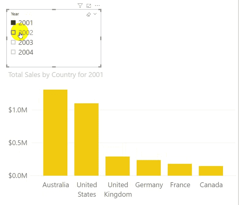
Here is an example to stimulate your thinking. Look at the chart title in the image above – boring! Now look at the title in the image below – ENGAGING, right!
Here is my DAX formula for the above header.
Chart Title = VAR SelectedYears = VALUES('Calendar'[Year])
              VAR numberofYears = COUNTROWS(SelectedYears)
              VAR LeadInText = "Total Sales by Country for "
              VAR TitleStub = CONCATENATEX(VALUES('Calendar'[Year]),'Calendar'[Year], " & ")
              VAR FinalTitle = LeadInText & TitleStub
              RETURN FinalTitle
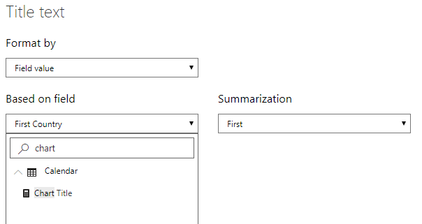
After writing the measure, I simply added it into the expression based formatting section for the chart title as shown below.
What to do Next
- I can help you with the DAX. I have more than 250 blog articles on this site where I share techniques for you to learn. You can also read my book and/or attend one of my instructor lead training courses (I have sessions covering all time zones around the world).
- If you want to influence where expression based formatting appears in Power BI, then you should head over to ideas.powerbi.com. Vote for other ideas that people have created and/or create your own. You can influence the outcome, but only if you participate.
- I can’t help you with your imagination, but I do suggest you read and watch widely to stimulate your thought juices. Jason wrote a great blog last week about how to create awareness of the drill through capabilities in Power BI. He got the idea after watching a Guy in a Cube video on animated images and his own skills, knowledge and experiences using Power BI. Sometimes you just need a spark to trigger your imagination. When you have an idea, then you should share it.
Genial Matt gracias por compartir.
This is an elegant, simple solution to make your Chart or even Table visual titles more meaningful. Thank you for this.
Hi Matt
Great article, two questions on your formula: 1) you aren’t using the variable numberofYears, wondering why it is there and 2) when I test this against my calendar table and select all 4 years….the title appears with the years in the wrong chronological order?
Yeah. I originally was thinking of doing something more like Jason mentioned in his comment, The idea I had was to work out how many years there were included, then work out if to use concatenate or a list of values. But then I changed my mind when I realised there were only 4 possible values. I just forgot to go back and delete the variables I didn’t need.
Adapting code per https://www.sqlbi.com/blog/alberto/2018/12/20/displaying-a-list-of-selected-months/, the chart title can be refined to show a dash for concurrent selections:
Chart Title =
VAR LeadInText = “Total Sales by Country for ”
VAR SelectedYears = VALUES ( ‘Calendar'[Year] )
VAR Result =
CONCATENATEX (
SelectedYears,
VAR CurrentYear = ‘Calendar'[Year]
VAR IsNextSelected = CurrentYear + 1 IN SelectedYears
VAR IsPrevSelected = CurrentYear – 1 IN SelectedYears
RETURN
IF (
NOT ( IsPrevSelected && IsNextSelected ),
CurrentYear
& IF (
IsNextSelected,
“-“,
“, ”
)
),
“”,
‘Calendar'[Year]
)
VAR Result =
LeadInText
& LEFT (
Result,
LEN ( Result ) – 2
)
RETURN
Result
You’ve defined VAR Result twice?