Readers of my blog may have read this previous article from Roland where he covered an introduction to dataflows. In this new article, Roland is going to share some ideas about using the new field parameters. If you haven’t subscribed to Roland’s YouTube Channel yet, I highly recommend that you do. He has a stack of high quality content that he shares regularly.
******
Thanks a lot Matt! I’m happy to be back as a guest contributor on Excelerator BI!
I think it is fair to say that just like many readers of this blog, I am super excited about this fairly new feature called Field Parameters.
Since Microsoft made it available in Power BI Desktop I have been playing around to see what’s possible with it. More importantly, how users of my reports can benefit from this. As we all know, a feature on its own might not be enough to provide a better user experience.
So today I would like to share with you a really cool way of implementing Field Parameters in Power BI reports.
Inspiration
I looked at the official documentation from Microsoft about Field Parameters (link below) and some demos online and realized that most of those examples are about the Dynamic X-axis reporting.
Let report readers use field parameters to change visuals (preview) – Power BI | Microsoft Docs
Meaning that report users can switch between “dimensions” of the data. This is great and already provides a much better UI and UX, but there was no information about the limitations of what “fields” can you add to the parameter table.
To be more specific, I couldn’t find any limitation about adding measures (Explicit Measures) to the Field Parameter.
I think you can see where my mind wandered after that…
I envisioned a user interface created with Field Parameters similar to what a Calculation Group setup could provide.
While this setup does not provide the additional benefits of a Calculation Group item, ie Field Parameters do not decrease the number of measures in the Power BI model, I still consider this a huge step forward in the report design and report consumption experience.
How To Visualize Data
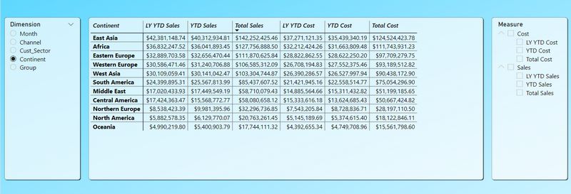
As I mentioned above my initial idea was to create a “plain” matrix with rows and columns to allow report consumers to adjust the details based on their analytical needs.
Each user would be able to utilize slicers to adjust what they want to analyse – picking the right measure(s) – and select how they want to analyse that – picking the right dimension.

I also realized that there is a huge potential for different data viz options. Don’t get me wrong, matrices are useful but sometimes they could be a bit overwhelming for those who are not that data savvy.
That’s when I started experimenting with column charts to see if I can use the measure parameter table on the Y-axis.
While the data, or I should rather say the parameters, are the same, I was positively surprised that switching over to a clustered column chart is as easy as changing the visual type.
After that Power BI handles both the X-axis (dimensions) and the Y-axis (measures) dynamically.
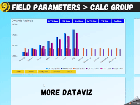
I can allow my report consumers to easily, quickly, and reliably switch between Sales Growth Analytics or Margin Analytics* by the dimension (or field) that makes the most sense to them.
*Sales Growth Analysis being LY YTD Sales vs YTD Sales while Margin Analysis is Sales vs Cost (either Total or YTD)
How To Further Enhance
Field Parameter tables can also provide some flexibility when it comes to data governance.
Report authors can set up Row-level Security profiles on both the dimension parameter table and the measure parameter table, limiting access to certain fields. And setting up RLS on those tables is as easy as creating RLS on any other table.
With a security setting like the one, I talk about in the video below different users or different teams within the organization can analyse the data differently.
Sales team members’ access can be limited to Customer details and sales measures, while marketing team members would be able to analyse data based on Product details and margin levels.
A similar structure would allow each member of the company to focus on their responsibilities and priorities while drawing better insight from the data.
I am absolutely sold on Field Parameters and I reckon it has been one of the most important updates when it comes to user experience for a long time.
And if you would like to follow along in more detail, make sure to watch the video I posted on my YouTube channel.
Once again, thank you Matt for having me and I wish lots of success to your readers with Field Parameters!
Roland
Thank you for your sharing. I am worried that I lack creative ideas. It is your article that makes me full of hope. Thank you. But, I have a question, can you help me?
Thank you for your sharing. I am worried that I lack creative ideas. It is your article that makes me full of hope. Thank you. But, I have a question, can you help me?
Genial, gracias por compartir!