At a recent training course, one of the students asked if it was possible to add two different columns on the legend of a line chart, so that when a selection is made on a second slicer the chart splits to reveal multiple lines.
Given others in the class showed interest in the subsequent conversation, I decided to create a short blog so that everyone could benefit.
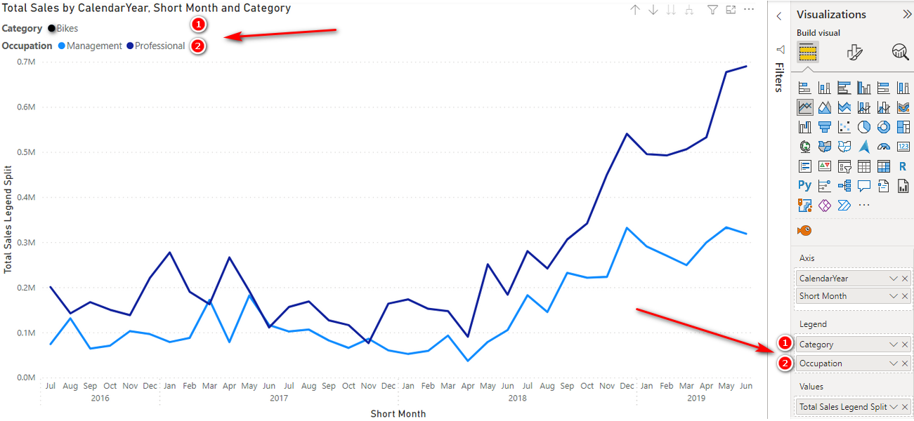
Plotting Multiple Columns onto a Legend
Unfortunately, the image above is pure fiction. Presently, this chart is only possible due to the wonders of Photoshop and image layering. The ability to add multiple columns to the legend of a line chart is not currently available in Power BI.
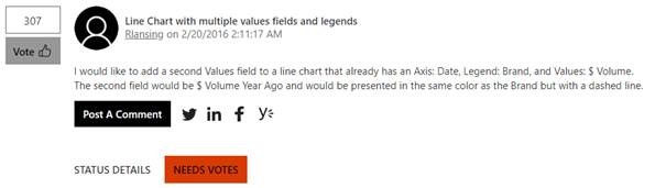
If you’d like to add your support to getting this capability integrated into a future release of Power BI Desktop, be sure to vote for it in Ideas.
Just click on the image below, sign in and vote.

In the meantime, we’re going to have to create a workaround to achieve the desired effect.
The Problem
To illustrate the issue we are trying to overcome, I have added a Total Sales line chart to my Adventure Works workbook, and put Products[Category] on the legend.

When I make a selection on Customers[Occupation], rather than presenting a line for each occupation, I get the aggregated value of the two occupations:
If the Category Slicer is changed to select both Accessories and Clothing, then we see two lines appear on the chart, displaying the aggregation of both occupations for each category.

This is the standard and expected behavior because we only have one Legend creating lines on the chart.
To enable the splitting of the Total Sales by Occupation as well as Category, we need to be able to add both columns to the Legend. This is not currently possible.

Identifying Sales by both Category and Occupation in one column
To be able to show multiple lines on the chart for both the Category and the Occupation slicers, we’ll need to make a change to the way our data model slices the Sales data.
The first thing to do is add a Calculated Column to our Sales table. Adding a calculated column to our data table is generally something that should be avoided, but because we need to write a formula over the data table, and that formula needs to slice and dice our data, we need to add it as a new column. For more on when and where to use Calculated Columns, have a read through the post on Calculated Columns vs Measures in DAX.
To achieve the desired result, the Calculated Column will need to take advantage of the RELATED() function, which will return a related value from another table directly connected to the current table.
Because we need to combine a slicing effect on both Category and Occupation, we’ll need to bring related values from both of these tables into one column, hence we’ll need to concatenate two RELATED() results together. Just don’t forget to add a text spacer in between the concatenated values.
(note if one slicer was forced onto single select, then you’d only need to use one RELATED() as the single select slicer would always be slicing the data.)
Right click on the Sales table and select New Column.
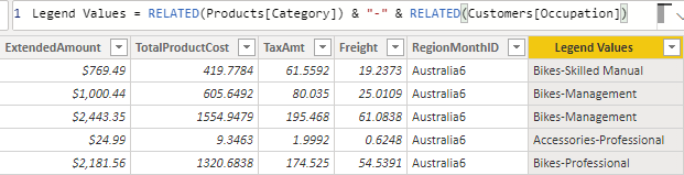
Legend Values = RELATED(Products[Category]) & ” – “ & RELATED(Customers[Occupation])
The result is a column in our Sales data that defines what and to whom the sale was.

Now we can simply use our new Legend Values column as the legend on our chart, and the lines will be split by the selection in both slicers.

However, there is now another issue that needs addressing. When there are no selections in either slicer, the result is a very noisy and unreadable chart.

One way to fix this, would be to only show the chart once a selection has been made.
Modifying Total Sales to return the aggregated value
Another approach to overcome this challenge is to modify our Total Sales measure so that if no selection is made, it returns a single line aggregating all values.
The change to Total Sales we are seeking, is to remove the filters the Legend is applying to Total Sales, so it displays a single aggregated line. This means our measure will be modifying the natural filtering behavior of the line chart, therefore we’ll need to use CALCULATE(), and the change we wish to make is to REMOVEFILTERS() from the Sales[Legend Values].
Total All Legend Sales = CALCULATE([Total Sales], REMOVEFILTERS(Sales[Legend Values]))
Placing [Total All Legend Sales] on the values of the line chart always results in an aggregated Total Sales line regardless of what has been selected, so by itself, this measure is not sufficient to overcome our challenge.

Slicer dependent display
The final fix required to give the desired effect on the line chart depends on a combination of the IF() and ISFILTERED() functions, which checks if there is a filter applied to the specified column of data.
The logic to be applied then is:
If there is a filter on Customers[Occupation] or Products[Category], give me [Total Sales] (result if true), otherwise give me [Total All Legend Sales] (result if false).
Total Sales Legend Split = IF( ISFILTERED(Customers[Occupation]) || ISFILTERED(Products[Category]), [Total Sales], [Total All Legend Sales])
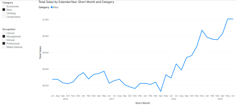
If we add this new measure to the chart we get our desired behavior.
When no selections are made, we see a single line with the aggregated values of all of our sales and when there is a selection in one or both of the slicers, the line is split, revealing the data values for each selection combination.

Final Thoughts
I realise this isn’t a perfect fix, but until the idea gains enough traction to make it onto the Developers’ To-Do list, this should help you resolve the immediate challenge of needing to plot two legends onto a single chart.
Download the workbook here: Plotting 2 columns on the Legend of a Chart
Your point of view caught my eye and was very interesting. Thanks. I have a question for you.
Nice workaround.
I think one scenario where I might use this is a situation where selecting an item from the first slicer (possibly using single select) displays only one line that is the total value for that item, then if multiples were selected in the second slicer, it would display the breakout lines.
I think I know how to do this. The one question would be if all items in the 2nd slicer were selected, would it display only one line or multiples.